Comments/Ratings for a Single Item
For editing diagrams from existing pages, it would be useful to be able to load the diagram designer settings from an existing generated URL
You can do that by replacing drawdiagram.php with diagram-designer.php while keeping the rest of the URL the same.
 H. G. Muller wrote on Thu, Dec 15, 2022 11:19 AM UTC:
I have a question on using image names in the code argument of the Diagram Designer. The example on the page here only shows an input that uses a single letter per piece, and shows how letters correspond to images on the right. But some piece sets have many more than 26 images. Now I noticed in the URL used for the static image in Central Point Chess that it would also possible to use a piece name in braces instead of a single letter, where the case indicates the color. Like {PAWN} or {king}. But this was for the alfaeriePNG set, which uses all-lowercase names for the images. How would that work for a piece set that uses mixed case, such as Abstract? Would the DD know that it alwasy has to capitalize the first character, and use upper-case W and B prefixes in such a case? And can one mix single-letter encoding with the braces construction?
[Edit] Never mind, I think I figured it out. The use of braces is a general method for allowing multi-character piece names, but the mapping of the names on names of image files is specified by the initialization $pieces array in the sets/*.php scripts. And only in sets/ auto-*.php scripts this mapping is set from all upper- or lower-case full names to the white and black image-file names.
These scripts differ only in the setting of the $dir variable. So I can easily clone those, to make auto scripts for AlfaeriePNG, AlfaeriePNG35, XBoard, XBoard33, Abstract, Motif, MagneticPNG, Utrecht and Utrecht (Small), in which besides using the full names you can also use single-letter IDs for the orthodox pieces (and perhaps some common fairies?) in the code parameter.
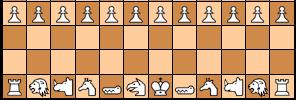
Below an example of a diagram using the AlfaeriePNG set:
Yes, it sounds like you figured it out.
Now that I have a better handle on how Alpha values work, I have gotten the Diagram Designer to use and pass them along to the PNG file. I have added a new parameter to drawdiagram.php called bgcolor, which is for the background color used when shrinking an SVG image to a particular size. Its default is FFFFFF00, which is a fully transparent white. When the Alpha value is given in bgcolor, it will just use the generated Alpha values for each pixel. When the Alpha value is not given, it will just color the outer area with a transparent color. The left image uses FFFFFF00 for the background color, and the second uses 666666 for the background color.
There is no difference between using a background color of FFFFFF00 and 00000000. They produce identical results. So, when the background color is fully transparent, its RGB values will not affect the results of the anti-aliasing.
When the Alpha value is above zero and so not fully transparent, the RGB colors do matter. Here is FFFFFF44 on the left and 00000044 on the right. The latter has more solid borders than FFFFFF00, and it has smoother borders than 666666.
Contrary to what I wrote below, GD will now makes the background transparent for any background color that was not fully transparent from the beginning. This keeps it from recoloring the whole space when using an Alpha value above zero.
H. G. Muller wrote on Sun, Dec 25, 2022 11:20 AM UTC:And if you make all board squares black, you would have the ultimate solid borders, which extend all the way to the square edge.
But if you want more solid outlines than a piece was designed to have, it would be better to make the stroke width an adjustable parameter of the Diagram Designer, just like the fill color. This is trivial to do, by doing a text replacement while the image is still SVG, before rendering it.
And if you make all board squares black, you would have the ultimate solid borders, which extend all the way to the square edge.
No, you would not. Any opaque or translucent background color is replaced with its fully transparent version after the SVG image is resized to a PNG. At present, this is done through a flood fill. For fully opaque black, the result is a loss of most of the border, as shown here:
I have already shown the result of a translucent black, and I have already mentioned that a fully transparent black gets the same result as a fully transparent white, which I previously illustrated. For the darkest borders, you can use an almost fully opaque black of #0000007e, as shown here:
Greg Strong wrote on Sun, Dec 25, 2022 02:53 PM UTC:You completely missed his point. And your "darker" borders are also blockier and jagged. You went through all this trouble to use vector graphics and then you hack it so that it looks crappy like the original. And I don't agree with H.G.'s suggestion to change the stroke width either. I have worked very, very hard on these graphics and I'd appreciate them not being messed up.
You now have all tools in place to fix the real issue. I don't understand why you not only won't do it, you will not even respond when we mention it. I will try again:
Your desire for darker boarders is because of YOUR SETTINGS. You want to compensate for this, but you are making the graphics look worse for other people. You are zooming in and so the image loses clarity. The point of vector graphics like SVG is that you can zoom forever without loss. If you want to render PNG, then you have a limited resolution. But if you generate a higher resolution then some zooming can be performed without loss. Render your image at double size and then use the height and width of the IMG tag to scale it back down. If you do this, then you can zoom up to 200% without any loss. It will look good with your setting and everyone else's as well.
You completely missed his point.
Which was what?
And your "darker" borders are also blockier and jagged.
If you don't like them, don't use them. They will be an option for those who prefer them.
You went through all this trouble to use vector graphics and then you hack it so that it looks crappy like the original.
In case you haven't noticed, the default behavior is to use a fully transparent background color, and this gives nearly identical results to rsvg-convert.
And I don't agree with H.G.'s suggestion to change the stroke width either.
I have ignored this suggestion, because I imagine it would distort the images and not achieve the effect I want.
I have worked very, very hard on these graphics and I'd appreciate them not being messed up.
I'm not messing up your graphics. I'm providing the option of displaying them with borders that are a little more boldface.
You now have all tools in place to fix the real issue. I don't understand why you not only won't do it, you will not even respond when we mention it.
I already tried rsvg-convert, then determined that I could get comparable results with Imagick.
Your desire for darker boarders is because of YOUR SETTINGS.
It's not darker borders, per se. It is for more solid borders that do not blend as much with the background, and this blending is more prominent in Interactive Diagrams that use the AlfaeriePNG set, which has nothing to do with my settings.
You want to compensate for this, but you are making the graphics look worse for other people.
I'm providing an option, and it is up to people whether they choose to use it.
You are zooming in and so the image loses clarity. The point of vector graphics like SVG is that you can zoom forever without loss. If you want to render PNG, then you have a limited resolution.
The Diagram Designer was designed using the GD library, which has no support for SVG. The solution to making SVG images work with it is to import than as PNG images.
But if you generate a higher resolution then some zooming can be performed without loss. Render your image at double size and then use the height and width of the IMG tag to scale it back down.
The Diagram Designer creates a single graphic image. It does not use tables or CSS to place image files on top of another image. So, there is no way to use height and width of IMG tags to adjust the size of SVG piece images in the diagram it produces.
H. G. Muller wrote on Sun, Dec 25, 2022 05:58 PM UTC:There are two independent issues here. One is a matter of taste. Some people like thin borders, other people like fat borders. Those who designed Alfaerie preferred to have borders as they are when the AlfaeriePNG set is rendered the normal way. Those who don't like that should design their own piece set. Not sabotage the use of the original piece designs to alter those to their taste. Just render the SVG with thicker lines and standard anti-aliasing, call it AlfacentauriPNG, and people to which it appeals might even use it.
The second issue is that converting transparent pieces at the boundary to darker ones to create the illusion of fatter borders is a very inferior method, which leads to ugly results. E.g. if you have a boundary that runs nearly vertical, there will be places where it coincides with a pixel boundary, so that there will be no adjacent half-transparent pixels, just a fully opaque one next to a fully transparent one, and the method adds nothing. In other places the border will cut a pixel in two, and make it half transparent, half black. By converting the transparency to black, you push the percieved boundary out there. So the line gets wobbly. If you want to push the boundary out, just move it out half a pixel before rendering, and render it anti-aliasing in the standard way. Which is the way designed to make the line appear as straight as possible.
H. G. Muller wrote on Sun, Dec 25, 2022 06:10 PM UTC in reply to Fergus Duniho from 05:19 PM:The Diagram Designer creates a single graphic image. It does not use tables or CSS to place image files on top of another image. So, there is no way to use height and width of IMG tags to adjust the size of SVG piece images in the diagram it produces.
Sure there is. You should just render the entire image twice (or 5 times) the size you want it, and use the width and height attributes on its image tags to scale it back to the size that was requested. Some comments down I posted a whole-board image generated with the Editor for scalable Diagrams that used that technique. Let me post it again:

Greg Strong wrote on Sun, Dec 25, 2022 06:19 PM UTC in reply to H. G. Muller from 06:10 PM:You should just render the entire image twice (or 5 times) the size you want it, and use the width and height attributes on its image tags to scale it back to the size that was requested
Yes, this is what I was suggesting. Have diagram designer render everything double. Have the square size be 100x100, the pieces be 100x100, the border be double. Then scale the final image back down.
Those who don't like that should design their own piece set.
That's a lot more work than changing a setting. So, no.
Not sabotage the use of the original piece designs to alter those to their taste.
Sabotage is a loaded and totally inappropriate word to use here. It's like a font designer saying that displaying his font in boldface is sabotage.
converting transparent pieces at the boundary to darker ones to create the illusion of fatter borders
That is not an accurate description of what I'm doing. I am simply adjusting the background color of the image before reducing it in size, and different background colors have different effects on how the edges get anti-aliased. Darker background colors generally produce a clearer separation between the border and the background of the space, which is the effect I'm going for.
Greg Strong wrote on Sun, Dec 25, 2022 11:51 PM UTC in reply to Fergus Duniho from 10:49 PM:Sabotage is a loaded and totally inappropriate word to use here. It's like a font designer saying that displaying his font in boldface is sabotage.
Absolute rubbish. It is nothing like that. You are changing a smooth transition into a blocky transition, a very obvious phenomenon that you have avoided acknowledging. Reduce your zoom to the default 100% and it will be quite obvious that the originals are smooth and yours are jagged. But I don't expect you to acknowledge this. This coversation has gone on long enough that I am reaching the conclusion that you are just being disingenuous. You have been very particular about how your graphics are to be used. It would be nice if you'd give others the same respect.
Here are some different boards for comparison. The first is a screenshot from Game Courier, in which SVG images have been recolored and placed on a board rendered as a table.

The next is the Diagram Designer drawing the board with SVG images at normal size.
The last is the Diagram Designer drawing the board five times larger, then displayed at 20% reduction.
Does anyone see any significant difference between these?
H. G. Muller wrote on Mon, Dec 26, 2022 07:07 AM UTC:Depends on how much you zoom in. At 100% they look identical (as they should; this is what anti-aliasing by definition does: reduce away the excess resolution that is not representable on the pixel lattice). At 500% (the max of my tablet) the first two look blurred, the third still looks crisp.
The difference is when the anti-aliasing is done: when it is done server side to get 50x50, the info needed to get good 200x200 is not available in the browser. So zooming in makes the image vague. If you leave the anti-aliasing to the browser, the zoomed image still looks good. (But it is the same process, so if you ask for the same resolution it gives the same result.) Because the higher spatial frequency components were sent to it, even when not needed or usable at 100%. But is will start to use them when the zoom factor requires it.
H. G. Muller wrote on Mon, Dec 26, 2022 07:42 AM UTC:And yes, I would call a word processor that gives me boldface when I ask for normal, or proportional spacing when I ask for fixed spacing sabotaged. Such tools should do as the user asks, not as their author pleases.
By rendering on grey you will replace the transparent part of a pixel that was only partly covered by the object gray. While for rendering on a light (say white) square it should have become white. So the pixel gets darker, creating the illusion that the blackness of the object covered a larger fraction of the pixel, and thus that its boundary moved outward. But it doesn't move outward where the boundary happend to coincide with a pixel boundary, and the adjacent pixel will just be pure gray, later converted to transparancy. This is what makes the percieved biundary ragged.
And white / black / grey even is a favorable example; when colors are involved you also get hue differences.
@Fergus: For me, the 3rd one is nicer. The contours of pieces are sharper and thinner.
(Seen on Mac, both with Safari and Firefox, no difference)
I would call a word processor that gives me boldface when I ask for normal, or proportional spacing when I ask for fixed spacing sabotaged.
That's just a complete disanalogy. Please pay attention to what is actually going on.
Greg Strong wrote on Mon, Dec 26, 2022 04:34 PM UTC in reply to Fergus Duniho from 02:23 AM:At regular zoom level, they are at least very close and possibly identical. The more you zoom, the better the last one looks in comparison. BUT - your first one should look every bit as good when viewed within game courier because that is rendering the SVG directly (if I understand correctly). By taking a screenshot of it you have rasterized it, losing the benefits. So #1 should be every bit as good as #3 in practice.
Although I could not detect much difference through visual comparison, I noticed greater differences after I took screenshots and replaced the original piece and space colors with the same color. Here they are in the same order:
Game Courier:
Diagram Designer, normal size

Diagram Designer, 5x larger reduced to normal size

H. G. Muller wrote on Mon, Dec 26, 2022 05:25 PM UTC:Could be just a matter of rounding. To the eye the 'non-original' colors that are left look indistinguishable from the original square colors.
Greg Strong wrote on Mon, Dec 26, 2022 05:25 PM UTC in reply to Fergus Duniho from 05:03 PM:I could not detect much difference through visual comparison
Did you zoom way in? If so, I can't see how you could miss it. It is literally the difference between these:


I took screenshots and replaced the original piece and space colors with the same color
I'm not sure what this is supposed to indicate, beyond the fact that they are different, but there are issues with your test. First, on #1 you have already corrupted the original output by going from SVG to PNG (vector to raster). Secondly, you didn't replace the original piece colors on #3.. I inspected the white pixels to verify that they are FFFFFF, so something went wrong with your expirement. And I still see dark pieces on #2, so probably something went wrong there too.
Did you zoom way in? If so, I can't see how you could miss it.
The comparison was about how they each appeared at normal size. This was to test your idea of drawing a larger image and then reducing it back to normal size. It was not a general comparison of SVG vs PNG.
First, on #1 you have already corrupted the original output by going from SVG to PNG (vector to raster).
For the reason given above, this is not relevant.
Secondly, you didn't replace the original piece colors on #3.. I inspected the white pixels to verify that they are FFFFFF, so something went wrong with your expirement.
I made multiple images and uploaded the wrong one. I have now corrected this.
I still see dark pieces on #2, so probably something went wrong there too.
No, nothing went wrong there. It was so hard to find the original color that I drew a block in that color to give me something to use the Change Color tool with. As indicated in the URL for that image, the original color was 5984bd, and I made sure that was the color to be replaced.
Greg Strong wrote on Mon, Dec 26, 2022 07:57 PM UTC in reply to Fergus Duniho from 06:23 PM:The comparison was about how they each appeared at normal size
Are you serious? You already said you "could not detect much difference through visual comparison". And Jean-Louis, H.G., and I have already responded. Regardless of how they appear at normal size, there is a difference if you operate your browser with a zoom, which many people do, INCLUDING YOU. And, for about the tenth time, you still have not acknowledged this.
Now you have resorted to making up "expirements" that I guess are supposed to demonstrate something. I am at a loss for any reasonable hypothesis why you're so desperate to ignore the actual issue and invent others, but it really doesn't matter. Since it's painfully obvious to me that you are just being intellectually dishonest, I see no reason to continue the debate.
You already said you "could not detect much difference through visual comparison". And Jean-Louis, H.G., and I have already responded. Regardless of how they appear at normal size, there is a difference if you operate your browser with a zoom, which many people do, INCLUDING YOU.
Yes, I wasn't focused on zooming, but you are right about that. Drawing the board at a larger size and displaying it at a reduced size does eliminate any problems caused by zooming. So, this was a very good idea. I just wasn't thinking about it from that angle. I was considering it from the perspective of how they looked at the same size, and that's what I thought you were offering this as a solution to. I now see you had something else in mind.
I am now going to look into giving the Diagram Designer the ability to produce SVG images. I'm not very familiar with it yet, but I have borrowed some books on SVG from Kindle Unlimited. With that in mind, I think it would be good to have SVG images of other piece sets.
Greg Strong wrote on Tue, Dec 27, 2022 10:21 PM UTC in reply to Fergus Duniho from 02:22 AM:Drawing the board at a larger size and displaying it at a reduced size does eliminate any problems caused by zooming
Excellent. I'm glad we've agreed that there is an issue and that we have ways to address it. Thank you.
I think it would be good to have SVG images of other piece sets
Indeed. I've made SVGs for probably a couple dozen of the Abstract set pieces over the last year or two. Unfortunately I can't upload them right now. The power cut out last night and since it's come back my file server has not wanted to turn on. Hopefully that won't be too hard to resolve and I have backups if need be.
I'm currently working on updating drawdiagram.php to use the scale value while drawing the image instead of after it is all drawn. Until I get it all working right, I am writing my code to /play/pbm/test.php. Lower scale values are multiples of 1, and higher scale values are multiples of 100%. Using a value for scale, you'll be able to draw a larger board without changing other parameters.
H. G. Muller wrote on Wed, Dec 28, 2022 08:17 PM UTC in reply to Fergus Duniho from Tue Dec 27 10:41 PM:It has always annoyed me that there is no quick and easy way to include a simple diagram in comments, as other Chess forums typically have. You would either have to upload something, or go to the Diagram Designer page to create a HTML image tag, and copy-paste that into your comment after switching it to source code (or know enough to isolate the URL from the IMG tag, and use that in the image-insertion dialog of the CkEditor in WYSIWIG mode). On Talkchess.com I only have to type a FEN of the position in the text of a posting, and sandwich it between [ fen][ /fen] tags.
It would be rather easy to also provide such a facility here. Just let the listcomment.php script recognize the [ fen] tags in the text of the comment, and replace it by an IMG tag referring to a FEN-to-diagram script, passing the latter the enclosed FEN as an argument. During storage in the database, or when editing, the position would retain its text form, so this doesn't interfere with anything.
I have made an adapted version of the listcomment.php script (just adding two lines to the latter) that invokes the Diagram Designer for inserting the image. When you would view this page with comments through that modified script (by replacing 'list' by 'hgm' in the address bar of the browser) the following line would show up as a diagram:
The current version of the Diagram Designer is not really ideal for this, as it is not able to derive the board width from the FEN, but needs a separate parameter for that (as a test further down the comment page shows). It also omits the last rank of the FEN when it is not complete. (The latter seems a bug, as it has no problem completing other ranks if it thinks these are too short?)
Okay, I have added a fen shortcode. If you have already set the set or the cols value with the set or cols shortcodes, it will use those values. For example:
You can also include extra parameters after the fen code, just as you would in a query string, because it's just going to plug your FEN code into a query string.
As an editor, just check the source code to see what the shortcodes look like.
H. G. Muller wrote on Thu, Dec 29, 2022 08:39 AM UTC in reply to Fergus Duniho from 01:03 AM:You can also include extra parameters after the fen code, just as you would in a query string, because it's just going to plug your FEN code into a query string.
A smart and convenient trick. This means we really don't need the 'cols' and 'set' shortcodes. The latter doesn't seem to be working anyway.
The purpose, however, is to make it as easy as possible for a noob user, who doesn't know the ins and outs of the Diagram Designer, and probably doesn't even know it exists. We cannot expect such users to know the 'cols' keyword, or query-string syntax, the 'set' keyword or the names of the available sets, etc. So it is important that we invoke the Diagram Designer with the most useful default values. To which we then append &code= plus the string between the fen tags. This would still allow 'power users' to overrule the defaults by adding parameters at the end of the FEN in query-string syntax, as in case of duplicat specification of a key, the one encountered latest will prevail.
set - I think auto-alfaeriePNG35 would be the best default here, (or an equivalent overly large set forced to display at reduced size) because:
- It has the largest number of pieces.
- It is small, allowing representation of large boards without problems.
- Orthodox pieces use their conventional icons, which each chess player will recognize.
- Pieces can be indicated by {name}. Apart from the orthodox pieces there are no universal single-letter abbreviations for chess pieces, and the alphabet is not large enough anyway, so non-obvious abbreviations would be more the rule than the exception. Users would know that they wanted a camel, giraffe or rhino, but even if these had letters assigned to them, these would not be C (cannon), G (griffon) or R (rook), and the users would be clueless as to what letter to use.
- For compactness the orthodox pieces and most-common fairies (Archbishop, Cannon, Elephant, Griffon, Marshall) can also be indicated with a single letter.
cols - This still should be automated. I propose to treat a setting cols=10000 (or some other large value that can never be used in practice) on the Diagram Designer as a special value, which would derive the true value from the length of the first row of the FEN in the code parameter. This would not interfere with the normal processing during the first row because it will be large enough to never make the board 'wrap' to the next rank automatically. And when the first slash is encountered, before padding the rank with 'holes', it can set $cols to the current length of the rank if it was 10000, and then proceed as normal. The fen shortcode can then invoke the DD with the parameter cols=10000.
colors - This is more a matter of taste, but I feel that the default colors are a bit 'loud' for embedded diagrams that only serve as illustration for what is explained in the surrounding text. I would prefer 'softer'colors (with a somewhat lower saturation), and a less prominant board margin, like
Other proposals are of course welcome.
H. G. Muller wrote on Thu, Dec 29, 2022 09:59 AM UTC in reply to Fergus Duniho from Tue Dec 27 02:22 AM:With that in mind, I think it would be good to have SVG images of other piece sets.
I also found SVGs in the XBoard themes collection for the orthodox pieces in Motif. The unorthodox Magnetic pieces seem to be mostly cut & paste jobs of the orthodox pieces, and should be easy to create that way from the orthodox SVG. I will have a go at it.
[Edit] OK, this is done. The original Magnetic set actually has two kind of pieces: outline and solid. As is usual for XBoard with its native pieces too, the solid pieces are used for black there. But it seems we only use the outline pieces on CVP, and just color those differently depending on whether they are used for white or black. So I did not bother to create unorthodox solid piece.
The entire set is now in /graphics.dir/magneticSVG.


[Edit 2] I now also did Motif. They are in /graphics.dir/motifSVG.


cols - This still should be automated.
It now is. Since the fen shortcode operates before including an image link to drawdiagram.php, it will use the length of the longest rank if the ranks are divided up by forward slashes and a value for cols has not already been supplied. This behavior is not built into drawdiagram.php itself, which will just use the default value if none is supplied. Here are some examples without any value for cols being specified.
I would prefer 'softer'colors (with a somewhat lower saturation), and a less prominant board margin
I don't like the colors in your example. I favor some variation on beige and olive, as these are the normal colors for tournament Chess boards. The coloring of the comments is based on beige and olive, though I substituted darkkhaki for olive, because olive was too light. Here's an alternative using the comment colors with wood for the border.
Too much of darkkhaki makes me feel queasy, though. Another alternative is the color scheme I used for Chess:
The dark squares may be a bit too loud while the light squares are too close to the background. Let's try bringing those colors closer together:
H. G. Muller wrote on Thu, Dec 29, 2022 06:10 PM UTC in reply to Fergus Duniho from 05:51 PM:I do like the third. The pale green contrasts well with both red and blue:
I do like the third. The pale green contrasts well with both red and blue:
From a distance, the blue and green kind of blend together, because both feel like background colors. Let me see if I can tweak something. Here I've increased the red and blue components of the blue color for the black pieces. Blue is still the largest component, but it's a little more purple for a better contrast with green, though not technically purple, since the red component is still lower than the green component.
H. G. Muller wrote on Thu, Dec 29, 2022 06:59 PM UTC in reply to Fergus Duniho from 06:50 PM:Something strange is happening: 6 comments ago (in the DD topic) I posted an 8x8 diagram, and as I recall it that looked OK. But now the coordinates run a-l, like there are 12 files (but files i-l stay empty), and the lowest rank with pieces is entirely missing.
the coordinates run a-l, like there are 12 files (but files i-l stay empty), and the lowest rank with pieces is entirely missing.
The function for calculating the longest rank was not handling braces correctly. I have now fixed that.


Why only the number of columns can be entered and not the number of rows?
Greg Strong wrote on Thu, Dec 29, 2022 10:49 PM UTC in reply to Jean-Louis Cazaux from 09:19 PM:Why only the number of columns can be entered and not the number of rows?
Because it will keep making new rows until it reaches the end of the FEN.
set - I think auto-alfaeriePNG35 would be the best default here, (or an equivalent overly large set forced to display at reduced size) because:
I have made auto-alferie-svg the default set. This is a new set I created today. You can now see it being used in earlier comments.
It has the largest number of pieces.
I believe that it is based on the SVGs Greg has made. So, I expect the total pieces may be the same. It looks like there are fewer SVGs, but that may only be because the SVGs are in only one color. While this set should have as many pieces as alfaeriePNG35, alfaerie-many has more than both, as several alfaerie pieces have not been converted to SVG yet.
It is small, allowing representation of large boards without problems.
SVGs are scalable. Larger images should simply display at a smaller size to fit the screen.
Orthodox pieces use their conventional icons, which each chess player will recognize.
I have assigned labels to many pieces. These mostly use letters and sometimes + signs for promoted pieces or numbers. I have favored single letters for pieces that are widely used or widely combined with other pieces in compounds. Compounds normally have two or more letters, though some common compounds have 1 letter. Double letters are also used for various multi-syllabic pieces. I'm avoiding piece labels with arbitrary use of punctuation.
Pieces can be indicated by {name}.
Same.
For compactness the orthodox pieces and most-common fairies (Archbishop, Cannon, Elephant, Griffon, Marshall) can also be indicated with a single letter.
Mostly the same. The Griffon is GR, because the General is G, as the General is widely combined with other pieces, and "General" also appears in the name of various pieces. Likewise, the Dragon is DR, because D is used for the Dabbabah or War Machine in many compound pieces. The Archbishop is also BN, and the Marshall is also RN.
Greg Strong wrote on Fri, Dec 30, 2022 01:25 AM UTC:I have made auto-alferie-svg the default set. This is a new set I created today.
Thank you. I'm pleased to see the alfaerie set as default, since it is the most complete and most recognizable. What is 'auto-alferie-svg'? This doesn't seem to be a GC piece set. I'd like to see an index.
While this set should have as many pieces as alfaeriePNG35, alfaerie-many has more than both, as several alfaerie pieces have not been converted to SVG yet.
For sure. There are dozens, possibly hundreds, of pieces that haven't been converted. Some are obscure, some have unknown purpose, and some just look terrible. I'd like to expand the set in a controlled manner. And there are even a few that have been converted that I'm not happy with. There are also a few more that are done and still need to be added. I have a few days off so I'll try to get a handle on this.
A lot is happening recently. Very happy to see it! Happy New Year, everyone!
This doesn't seem to be a GC piece set. I'd like to see an index.
I have added it to sets.php, and it's now displaying properly.
I don't know where you see the default as Alfaerie-SVG. What I see on this page when I open it is the Set as Abstract 1: Compound & Misc.
H. G. Muller wrote on Fri, Dec 30, 2022 09:40 AM UTC in reply to Fergus Duniho from Thu Dec 29 11:59 PM:While this set should have as many pieces as alfaeriePNG35, alfaerie-many has more than both, as several alfaerie pieces have not been converted to SVG yet.
This should be viewed as a temporary situation. In the process of putting Interactive Diagrams in existing articles, I create new SVG (and corresponding PNG and PNG35) when these use alfaerie-many pieces that had not been converted yet.
I can add that many images in the alfaerie-many set are duplicats or transforms (i.e. rotated or recolored pieces). The latter we don't really need; the DD already supports recoloring SVG, and it could be made to support general rotation of SVG pieces as well. In the CGI rendering engine I did this through allowing > and < characters in the FEN for indicating rotation of the preceding piece. In the alfaerie-many set the rotated pieces have ma,es that end in <number> pluc 'cw' or 'ccw' (for clockwise and counter-clockwise, respectively, the number indicating the rotation angle in degrees). The DD could recognize these character combinations as suffixes, and apply the requested rotation. So that, say, {frog180cw} would give you an upside-down black Frog. The suffix 'rev' is generally used for indicating a horizontally flipped piece. (Unfortunately for piece names that ended in a number, because these were duplicats, the number is again appended to the suffix, so a flipped camel2 is camelrev2 rather than camel2rev.)
As to the duplicats: there are alternative Camels and Elephants. I cannot imagine why a piece theme would need duplicats; I do not consider those Alfaerie pieces. When you start to represent the same pieces by other glyphs you are in fact making another font.
These mostly use letters and sometimes + signs for promoted pieces or numbers.
Because the + prefix is a well-established convention in Shogi, it might be a good idea to allow such prefixes to appear in FEN without the need for enclosing braces. (WinBoard does this, for instance.) So a + would automatically be grouped with the single letter that follows it.
H. G. Muller wrote on Fri, Dec 30, 2022 10:14 AM UTC in reply to Jean-Louis Cazaux from 06:51 AM:Jean-Louis Cazaux wrote on 2022-12-30 UTC
I don't know where you see the default as Alfaerie-SVG. What I see on this page when I open it is the Set as Abstract 1: Compound & Misc.
I suppose that what Fergus meant is that the use of this set is default in diagrams embedded in comments through use of the fen tag. The Diagram Designer itself cannot change its default set, because this would break all diagrams on the website that rely on the current default (and are using piece names that are only known in that set, or which might mean something different in the new default set).
there are alternative Camels and Elephants.
I see a Mammoth in addition to an Elephant, but I don't see any alternative Camels. What is the alternative Camel called?
One of the main duplications I see is between General and Guard, which are the same piece with different designs and names. Since they start with the same letter, I have given labels to the General pieces and not to the Guard pieces.
Because the + prefix is a well-established convention in Shogi, it might be a good idea to allow such prefixes to appear in FEN without the need for enclosing braces.
Maybe in the future. I first have to finish getting the scale parameter to work while drawing the board in all shapes and rendering methods.
H. G. Muller wrote on Fri, Dec 30, 2022 02:38 PM UTC in reply to Fergus Duniho from 01:57 PM:I see a Mammoth in addition to an Elephant, but I don't see any alternative Camels. What is the alternative Camel called?
I meant in the old GIF pieces (Auto All Alfaerie). That has a camel2 and an elephant2. The Mammoth, Scorpion, Sabretooth and Owl were added by me to the SVG set, and do not exist as GIF images.
Here's a color for Black I want to try out. It's sort of a dark chocolate color with more red than blue and more blue than green. It seems to contrast well with the beige and olive spaces, and it looks more like black than the usual red and blue colors we've used for pieces. I'll test it out more later.
Greg Strong wrote on Fri, Dec 30, 2022 03:38 PM UTC in reply to Fergus Duniho from 03:22 PM:Here's a color for Black I want to try out. It's sort of a dark chocolate color with more red than blue and more blue than green
I'm sorry, I don't like that one at all. I think it's too dark and I consider it quite unattractive.
Can't we just stick with the default colors we've been using? They have served us well for a long time. The yellow is a bit more mustard than I would like but we're unlikely to find anything that is perfect for everyone.
I'm sorry, I don't like that one at all. I think it's too dark and I consider it quite unattractive.
In my mobile tests, it does appear too dark, and it even shows up as black in A2 mode on my Likebook Mars e-ink device.
This increases the green and blue values for a more plum color.
It's still too dark on mobile devices, though at least it's not black in A2 mode.
I had already mentioned that: the Owl doesn't fit well with the SVG set. The strokes are too thin. And the design is not very nice. Not in harmony with the rest.
Mammoth, Sabretooth are nice. Scorpion is nice too, maybe just a bit too big.
H. G. Muller wrote on Fri, Dec 30, 2022 06:43 PM UTC in reply to Greg Strong from 03:38 PM:I'm sorry, I don't like that one at all. I think it's too dark and I consider it quite unattractive.
I still don't see what was wrong with the square colors used by Zied's Board Painter. These are quite light:
The first one proposed by Fergus also seemed to have good contrast:
Greg Strong wrote on Fri, Dec 30, 2022 07:16 PM UTC in reply to H. G. Muller from 06:43 PM:I still don't see what was wrong with the square colors used by Zied's Board Painter
These are ok. Not crazy about it, but I can live with it.
The first one proposed by Fergus also seemed to have good contrast
This is nice except that the light squares are exactly the same as the comment background, so they disappear into it, so it should have a border color.
And as long as we are volunteering suggestions, this is what I use as the default in ChessV:
The first one proposed by Fergus also seemed to have good contrast
This is nice except that the light squares are exactly the same as the comment background, so they disappear into it, so it should have a border color.
I originally made it using the Abstract pieces, but now that I see it with the Alfaerie pieces, it seems to work better. I like how the square colors contrast well with each other while also contrasting well with the piece colors. It doesn't look too bad without a border, but since it does use the same color as the comment background, here are some alternatives that don't.
H. G. Muller wrote on Fri, Dec 30, 2022 10:13 PM UTC in reply to H. G. Muller from Thu Dec 29 09:03 PM:Some more 'small' SVG:


 Greg Strong wrote on Sat, Dec 31, 2022 02:01 AM UTC in reply to H. G. Muller from Fri Dec 30 10:13 PM:
Nice! Not high urgency, but it's nice to see the original pieces getting a renovation.
Greg Strong wrote on Sat, Dec 31, 2022 02:09 AM UTC:I have converted 23 pieces from the Abstract Piece Set to SVG and placed them in /graphics.dir/abstractSVG. They should be extremely close to the originals. The geometric nature of them made it fairly easy to match most of them up exactly.


I'm considering changing the comment background color to #FFFFF0 to match the ivory page background color. This would make it easier to use darkkhaki and beige for the diagram colors, since in my mobile tests, darkkhaki contrasts better with the pieces than olive or olivedrab do. The left board shows the darkkhaki and beige board against an ivory background. The right board uses darkkhaki and whitesmoke.
I tweaked the Vao. I erased the corner of the rectangle sticking below the triangle, and I adjusted the width and positioning of the base to better align with the base of the triangle. It looks like it could use a little more adjusting, but I'll have to reread a bit to learn how to get the precise values to use.
Okay, I got the left and right x coordinates for the triangle's base and used these to match the lower base to it.
In both my desktop and my mobile devices, it looks like the combination of darkkhaki and whitesmoke has the best contrast all around, and it's similar enough to the green/white or olive/beige coloring common to many tournament Chess boards.
Since the triangular part of the Vao wasn't showing up on my Likebook Mars, I rewrote that part to use polygons instead of paths. While it's showing up in Firefox, the main issue was with Chrome, and this appears to be a Chromium-wide problem, as it is not displaying on Chrome, Edge, or Vivaldi on my desktop even when I have it display the local file from my computer. So, maybe switching from path to polygon didn't fix anything.
I finally fixed the Vao in Chromium-based browsers. Looking at the SVG code, the style code for the triangles included ;filter:url(#filter855) even though this filter was not defined anywhere in the SVG code. I removed it to see what effect it would have. The image in Firefox remained unchanged, and the image in Chrome, Edge, and Vivaldi all now showed the triangular base.
Greg Strong wrote on Sat, Dec 31, 2022 10:25 PM UTC in reply to Fergus Duniho from 06:05 PM:Okay, I got the left and right x coordinates for the triangle's base and used these to match the lower base to it.
Try InkScape. No reason to hack the SVG text directly if that's what you are doing.
I've also touched up the zebra.

Try InkScape. No reason to hack the SVG text directly if that's what you are doing.
I already did, and then I worked with the code directly. Writing SVG directly is better for the same reasons as writing HTML directly. It offers more control and precision.
Greg Strong wrote on Sat, Dec 31, 2022 11:27 PM UTC in reply to Fergus Duniho from 09:30 PM:
;filter:url(#filter855)
Very interesting. This is similar to the code that was injected into the Chancellor that Jean-Louis reported that I can't explain. Perhaps we should just search the text for "filter:url" and get rid of all of that. Absolutely nothing I have done should involve hitting the web to load any filters. AFAIK my images should be nothing but local layers, paths and polygons.
Greg Strong wrote on Sat, Dec 31, 2022 11:32 PM UTC in reply to Fergus Duniho from 04:12 PM:I'm considering changing the comment background color to #FFFFF0 to match the ivory page background color. This would make it easier to use darkkhaki and beige for the diagram colors, since in my mobile tests, darkkhaki contrasts better with the pieces than olive or olivedrab do.
Is this really necessary? We need to change the color scheme of comments just to get the color scheme you've decided we should have for board diagrams? I think it would be appropriate to get some community feedback on what colors are desired before we start making far-reaching changes. I've heard nothing on why the standard board colors we've been using for 15+ years are no longer acceptable. And, if it's decided they should change, then we should vote on a replacement.
H. G. Muller wrote on Sun, Jan 1, 2023 12:20 AM UTC in reply to Greg Strong from Sat Dec 31 2022 11:32 PM:I think those colors are too loud. I would like colors with a somewhat lower saturation, so that the embedded diagrams don't draw all the attention.
Is this really necessary? We need to change the color scheme of comments just to get the color scheme you've decided we should have for board diagrams?
In a later comment than the one you're responding to, I indicated a preference for a different color combination that doesn't include beige. So, I am no longer thinking of changing the comment color to accommodate a board with beige spaces.
I think those colors are too loud.
Which colors are you referring to?
Greg Strong wrote on Sun, Jan 1, 2023 12:58 AM UTC in reply to Fergus Duniho from 12:25 AM:I object to the lack of process.
I will restate again, we have colors we have used for a very long time. They are not what I would choose, personally, but they have worked:
It's possible that these colors are what nobody still here would specifically choose, but they could still be a reasonable compromise. If we are going to make a change, then we need a DEFINED PROCESS. If we need a change, why, what are the criteria, and how are they to be judged? This is a long established forum, the results of which are the results of the free contributions of hundreds of people. Given that, we cannot make such sweeping changes just because one editor wants to.
I will anticipate the response: these changes are forward-only changes and have no effect on the existing content. Ok, while there is truth to that, the argument is insufficient. The only reason this forum has any value, (the only reason people are reading it), is because of the established content. And it only continues because a community drives it forwards. Almost no one would be here if it wasn't for our foundation. We stand on the shoulders of giants.
So any posting of new default color schemes is completely inappropriate without first establishing a DEFINITION OF PROBLEM to be solved and a PROCESS for how changes are to be submitted and results are to be measured.
So any posting of new default color schemes is completely inappropriate without first establishing a DEFINITION OF PROBLEM to be solved
H. G. did this several comments ago by complaining that the colors were too loud. I added the criterion that the colors should generally reflect the olive/beige coloring used in tournament boards. H. G. also praised one of the color combinations I offered for how well the colors contrasted with each other. Let's look at some boards side-by-side and compare them on these criteria.
- With the change in pieces, the one on the left seems less loud than it did before, though it may still be louder than the one on the right.
- On my desktop at least, both seem to have high contrast. The yellow spaces on the left contrast very well with the blue pieces, and the green is bright enough that it contrasts well with the more subdued blue of Black's pieces. The dark khaki color is technically a yellow and it also contrasts well with the blue pieces. The white smoke color is different enough from the full white of the White pieces to contrast with them.
- The left board has green for dark spaces, and the yellow spaces may be accepted as a substitute for beige or white. The right board has off-white spaces, and its dark khaki spaces seem green when they aren't being compared directly to green. It also resembles the olive color more than it does other greens.
I had to post the previous comment before I could look at the two boards on my mobile devices. On these, the dark and light spaces contrast better on the darkkhaki/whitesmoke board. On the e-ink screen of my Likebook Mars, neither appears loud, and the spaces are shades of gray. On my Fire tablet, colors don't appear as bright as they do on my desktop monitor. So I don't find either to be too loud.
H. G. Muller wrote on Sun, Jan 1, 2023 09:21 AM UTC in reply to Greg Strong from 12:58 AM:So any posting of new default color schemes is completely inappropriate without first establishing a DEFINITION OF PROBLEM to be solved and a PROCESS for how changes are to be submitted and results are to be measured.
Well, since it seems that I am the one who raised this issue, let me formulate a formal definition of the problem:
I think the yellow/green/blue board colors that are the defaults of the Diagram Designer, although excellently suited for the main diagram in an article, are are to 'loud' for embedded diagrams in a comment (for which my imagined use case would be mainly to illustrate issues in specific positions). With this I mean they would attract more visual attention than they deserve, and thus would become a distraction.
Since we are creating a new feature here for general use, it seemed wise to give its design some serious thought rather than just slamming something together that happened to work. Color schemes were one of the aspects I identified as possible target for optimization. Note that in the context of the 'instant diagram' people are much less likely to customize it than when they use the DD through the design interface in its article, so defaults become a more important issue.
I would prefer somewhat softer colors for the board.
BTW, I consider the khaki/smoke theme presented in Fergus' latest posting excellent.
As to the process: it seems to me this is well under way. Everything said so far has been only a proposal, and all editors that have an opinion on this matter can chime in. I can add that w.r.t. other proposals I have made for improvement of this website, there has been disappointingly little interest from other editors in those.
I will anticipate the response: these changes are forward-only changes and have no effect on the existing content. Ok, while there is truth to that, the argument is insufficient. The only reason this forum has any value, (the only reason people are reading it), is because of the established content. And it only continues because a community drives it forwards. Almost no one would be here if it wasn't for our foundation. We stand on the shoulders of giants.
I am not sure what point you are trying to make. Why would creating new features diminish the value of this website? Why would the fact that designing it in a certain way would be the best way to do it be an 'insufficient argument'? I would say it is the only argument.
I think the yellow/green/blue board colors that are the defaults of the Diagram Designer, although excellently suited for the main diagram in an article, are are to 'loud' for embedded diagrams in a comment (for which my imagined use case would be mainly to illustrate issues in specific positions).
Let me point out that shortcodes also work on member-submitted pages, which means this feature is not limited to comments. So, I'm not coming at this from the perspective that comments need different defaults than articles do.
H. G. Muller wrote on Sun, Jan 1, 2023 03:18 PM UTC in reply to Fergus Duniho from 01:32 PM:So, I'm not coming at this from the perspective that comments need different defaults than articles do.
But we should be aware that the technical possibility exists to use different defaults in both cases. And that this might make sense. After all, we also print the comments on different background color as the articles.
Greg Strong wrote on Sun, Jan 1, 2023 03:51 PM UTC in reply to H. G. Muller from 09:21 AM:BTW, I consider the khaki/smoke theme presented in Fergus' latest posting excellent
I do think these are aesthetically pleasing. If there are no objections then they are fine with me.
But we should be aware that the technical possibility exists to use different defaults in both cases. And that this might make sense. After all, we also print the comments on different background color as the articles.
I think this makes sense. Making the khaki colors the defult only for comments seems like a good idea.
BTW, I consider the khaki/smoke theme presented in Fergus' latest posting excellent
I do think these are aesthetically pleasing. If there are no objections then they are fine with me.
I have made these colors default for the time being, but I am not happy with the result. The board feels less solid to me because of the lightness of the colors, especially without a border around it. For the dark squares, I think I would favor a green that is bright enough to contrast with the duller blue of Black's pieces, as we have in Diagram Designer's defaults, and light squares that are closer to white than the yellow in those defaults.
Here is another suggestion alongside the present default:
Greg Strong wrote on Sun, Jan 1, 2023 06:25 PM UTC in reply to Fergus Duniho from 06:00 PM:Here is another suggestion alongside the present default
It's ok, but I like the looks of the khaki scheme better.
The board feels less solid to me because of the lightness of the colors, especially without a border around it.
How about a thin black outline around the squares? Is that possible?
EDIT: I mean one outline around the whole board, not an outline around each square
H. G. Muller wrote on Sun, Jan 1, 2023 09:19 PM UTC in reply to Greg Strong from 06:25 PM:EDIT: I mean one outline around the whole board, not an outline around each square
The problem with an outline is that there could be irregular boards (like Omega Chess). The DD suppots this by interpreting a hyphen as a 'hole', in the color of the rim. But the outline would then not follow the boundary of the playing area. So it would be nicer if the light squares are distinguishable from the background.
I don't like the khaki/smoke scheme and I think this can be pinned to the following two factors:
-
It does not from a well-defined board boundary on the present background colour (this is probably easy to cure with an outline)
-
The colour difference between the interior of a white piece and a light board square is just noticeable, but not really a contrast. This does not look right.
H. G. Muller wrote on Sun, Jan 1, 2023 09:54 PM UTC:Almost all pieces from the 'small' set are now available as SVG, in /graphics.dir/utrechtSVG .
Perhaps we should take the opportunity to better organize the file system? I think it would be better if all SVG pieces resided in a directory /graphics.dir/svg/<setname>/ , rather than just slamming a suffix SVG on the setname. Once the images are in common use it would be too late to do that.
Perhaps we should take the opportunity to better organize the file system? I think it would be better if all SVG pieces resided in a directory /graphics.dir/svg/
/ , rather than just slamming a suffix SVG on the setname.
I would prefer that too.
H. G. Muller wrote on Mon, Jan 2, 2023 01:10 PM UTC in reply to Fergus Duniho from 02:09 AM:I would prefer that too.
OK, I moved the SVG sets that I created recently to /graphics.dir/svg/magnetic/, /graphics.dir/svg/motif/ and /graphics.dir/svg/utrecht/. The XBoard SVG pieces were in /graphics.dir/svg/xboard/ already. I made an index page with an overview of the Utrecht SVG set.
I'm feeling stupid. This discussion with tens of messages from Fergus, HG, etc. is related to what?
It is linked to Diagram Designer page but I don't understand what it is for. I see no change on that page. Can it be explained?
I do feel my question is stupid but I really don't understand what you are talking about.
Beside this, how do you do to embedd images of diagrams in your comments? Is there a trick?
Thank you.
H. G. Muller wrote on Mon, Jan 2, 2023 03:39 PM UTC in reply to Jean-Louis Cazaux from 01:40 PM:Beside this, how do you do to embedd images of diagrams in your comments? Is there a trick?
Yes, there is a trick, and this is what the discussion is about. Just write a FEN of the position you want to show as part of your text, and surround it by 'tags' [ fen] and [/ fen] (without the internal space, which I just added here to prevent the word 'and' will be interpreted as a FEN of a 3x1 board).
E.g. [ fen]nqkrb/ppppp/5/PPPPP/NQKRB[ /fen] would give you:
Greg Strong wrote on Mon, Jan 2, 2023 08:43 PM UTC:The chancellor2 and cardinal2 are not being recolored for some reason.
It was using ctype_lower, which checks whether every character is lowercase, and these had numerals in them. So, I replaced ctype_lower with my own function haslower, which checks whether any character in a string is lowercase.
I have grown to hate the darkkhaki/whitesmoke board, mainly for the darkkhaki squares, which have begun to look like gold to me. They seem very bright and flashy, as well as less solid.
Here are the characteristics I think the default board should have:
- It should not be too loud, bright, or flashy.
- It should appear solid enough that it doesn't need a border.
- There should be good contrast between all the colors.
- It should generally follow a green/white color scheme
This green/white layout looks good and has no annoying flaws.
H. G. Muller wrote on Tue, Jan 3, 2023 06:07 PM UTC in reply to Jörg Knappen from 05:28 PM:Yep, good enough for me.
I've now changed the default to the green/white combination I posted last night. For the sake of contrasting with the blue pieces, I made the green brighter than the blue, and I gave it more red than blue. To better contrast with the white pieces and the beige background, I made the light squares an off-white that is darker than full white, and to better contrast with the blue pieces, I made the red and green components slightly higher than the blue component. But I avoided making it into a clear yellow, because the use of yellow generally added to the brightness of the board.
100 comments displayed
Permalink to the exact comments currently displayed.
I have updated the ability to mark moves. The ! symbol now displays a dot in the last color. So, if you want to use a specific color, you can add it to the list of colors.
The braces can now be used to display multiple items on the same space. Symbols between braces should be separated by spaces. They will be drawn in the order that they appear. So, if you want a dot over a piece, put the piece label first, then after a space, put a # or !.