James Spratt wrote on Tue, Jul 4, 2006 08:49 AM UTC:
I don't know if drawing a piece in a way which describes its move, or
including some kind of graphic move indicator, like the Drapt pieces, is
practical, mainly because the icons may be adopted for another variant
later and its move altered. I tried marking the bases of my Jetan variant
sculpted pieces at first with graphic indicators, but that locks you in to
one type of move for that piece, which isn't always desirable if you want
to use the same piece differently in another variant.
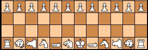
A few things I realized while studying Jean-Louis Cazaux' set:
Icons can be either instantly recognizable by most people, such as most
animals are, or they must be memorized, such as abstract or heraldic
images must be. While abstract or heraldic icons can lend dignity to the
look of a board, they can steepen the learning curve of a new game a
little due to the fact that a new player must first labor to remember what
the pieces are, in addition to how they move. That's okay if you like the
game to look more mysterious to newcomers, or make them work a little
harder; the experienced player will have a stronger advantage over a
newcomer at first, also.
All the icons in a set should look like they were drawn by the same hand.
Consistency of size, color, or line quality and execution tend to unify
any single piece with its brothers. Although realistic draftsmanship can
be a nice feature, it is not a necessary feature, except for easy piece
identification at first; consistency of 'look' across a piece-set is
more important, and there are an infinite number of ways to stylize icons
homogeneously.
I am partial to realism, or possibly a cartoony but recognizable type of
whimsy, as the best look for icons, based on my experience with art, which
has always shown me that more people like realism than abstraction, mostly
because they can tell if you got it right or not. I've always had to keep
an eye out for the new customer because I believe that to expand the
client-base I have to make it easy for them to recognize the subject, then
show them something new about it (content) and feel that the same thing is
true with any form of art, such as chess icons.