Comments/Ratings for a Single Item
For me, light brown text in brown Dark mode is significantly less readable.
That's going to vary with the device and the person. That's why there is now a third color scheme.
I have updated PHP to 8.1.28, and I will be going over the error logs for things I have to change to keep up with this new version. If anything stops working, let me know.
Ah, forgot to say. Color scheme changes’ saving doesn’t work!
No, it works, but sets darker mode when turning to dark and vice-versa.
Yes, the saving worked, but when writing the form on mobile, it was using the wrong condition to add " SELECTED" to the darker option. That's now corrected.
That's now corrected.
I see
And maybe you’ll make text in brown dark mode if not whiter but bit brighter?
I have now updated Mobile Detect to 4.8.06. Since it works differently than the old version, mobile detection was a bit wonky until I got it working correctly.
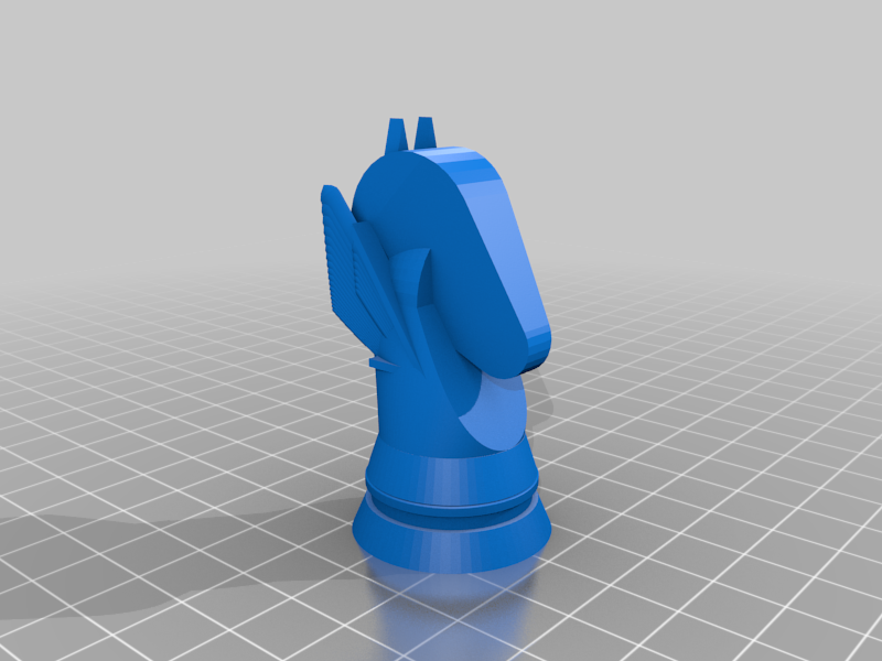
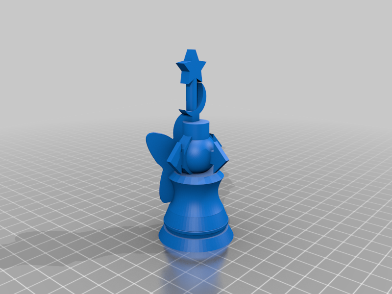
I'm thinking of making a logo specifically for the Darker color scheme using piece designs for 3D printers. However, I want to use images without a background behind them, and I think it would be appropriate to include a Nightrider, though it doesn't look like anyone has made one. Since Bob Greenwade and Jean-Louis Cazaux are the most active in making such pieces, one piece from each might be appropriate. What ideas do you guys have?
I do have a Nightrider, though given a choice my favorite piece that I've designed has been a Bodyguard.
I'll link the Thingiverse images of both tomorrow morning, and probably make neutral-background images as well.
@ Fergus: I can make an image of any 3D piece without any background. Just tell me which one from here if you want to make a test:
https://www.chessvariants.com/craft/a-catalog-of-3d-printable-chess-variant-pieces
Of course, that can be done with Bob's pieces as well.
Maybe Archbishop and (sorry but I just suggest) my Zip or (better) Torch?
Both these my pieces have 3D models made by Bob.
My Nightrider and Bodyguard, as promised:
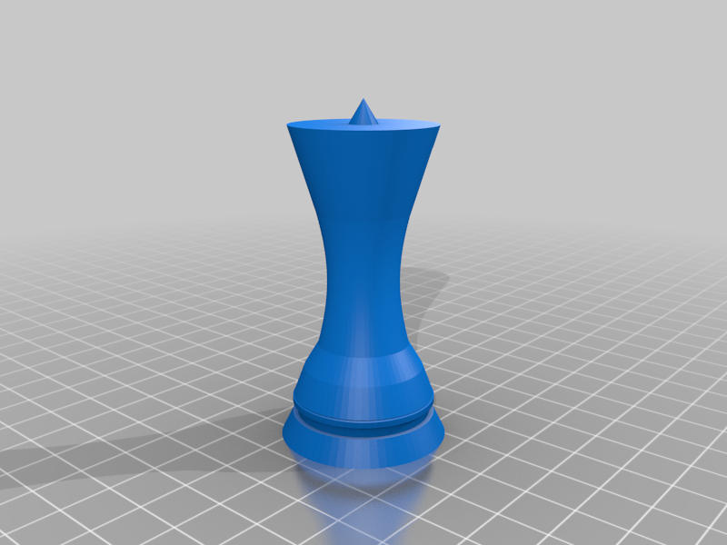
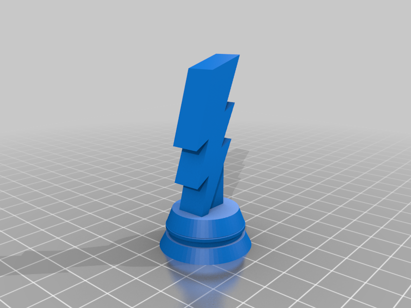
Since Lev mentioned them, the Zip and Torch:
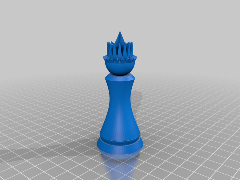
And, just for giggles, my Grandmaster Mage and Anvil:

I can set about making the neutral-background pieces just about any color you want, if there's a preference. I'll assume want just the first two unless you say otherwise (though I may do them all just for the heck of it).
The main reasons I'm interested in a Nightrider are that (1) it fits a nocturnal theme, (2) it resembles a regular Chess piece enough that someone could recognize it as a Chess variant piece if they saw it out of context, and (3) it is one of the better known fairy chess pieces. Some other pieces of yours that might work for the first two reasons are Midnighter, Moonrider, Thaumaturge, and Luna Pawn. So I would be interested in seeing these with a neutral background too.
Let's try the cannon, the chancellor, the dragon king, and the phoenix.
I wasn't sure what you'd want/be able to use as far as piece and background colors, so I just played with it a little. I can change them as desired.
Here's the Midnighter and Thaumaturge, for starters.


And I still do like my Phoenix.

I'll get the others you asked about later in the day, once I know your color preferences (other than being careful with reds).
This is for the Darker color scheme, which has a black background. Blue will be fine, since it shows up well against black, and it contrasts with another piece being white. The tallest piece in the Dark scheme's logo is 427, and the height of the logo is 432. Without the pieces, the text part of the logo has a height of 415. If I do like I did with the Light logo, a piece height of 285 would work.
I'm trying to change the visibility of this page to members-only from private, but it says "you are limited to submitting nine of your games for review and publication at a time" and fails even though I only see that I have two submissions for review. Is the submissions for review page not showing everything?
I think I fixed the conditional. So try it again.
That worked
This is for the Darker color scheme, which has a black background. Blue will be fine, since it shows up well against black, and it contrasts with another piece being white.
So, should I use #0000FF or another shade of blue?
I was thinking, in keeping with the row of figures across the bottom of the Light-themed logo, to make the pieces different colors (nothing outrageous; mainly ivory, tan, grey, muted red, that sort of thing that you might see in an actual chess set).
I figure to leave any resizing and cropping to your (probably more capable) hands.
I agree with your 2) and 3), especially 3). Unfortunately I never made any Nightrider so far. This because I don't like leaper-runners which are difficult to predict on board. But I might do one, one day, as well as the Grasshopper.
I would add another criteria: the 3D piece which is represented should be realistically 3D-printable and not too fragile.
@Bob: which viewer or software do you use to get those images? Blender? or something else, maybe more friendly?
I'm opening the STL files in Paint 3D. Using the 3D view, make the canvas visible and expand it to 8000x6000, and it can be any color desired with the paintcan "fill" function (as can the piece itself).
So, should I use #0000FF or another shade of blue?
Whatever you have been using is fine, or you could use the same color as the Alfaerie pieces use, which is #5984BD.
I was thinking, in keeping with the row of figures across the bottom of the Light-themed logo, to make the pieces different colors (nothing outrageous; mainly ivory, tan, grey, muted red, that sort of thing that you might see in an actual chess set).
While the Darker scheme can be used on monitors, tablets, and phones, I designed it mainly for monochrome eink displays, and my Likebook Mars eink device renders red as black. So colors with mostly red will not work out well on that or similar devices. Since blue is used for the Alfaerie pieces and shows up well on my Likebook Mars, I figured it would be a good choice.
I figure to leave any resizing and cropping to your (probably more capable) hands.
I suppose if I resize it against a black background, it will look fine.
OK, well, here's my shot at a Nightrider image. If this works for you, I'll get to others tonight and/or tomorrow.

25 comments displayed
Permalink to the exact comments currently displayed.
For me, light brown text in brown Dark mode is significantly less readable. And comments’ text is still white and readable.