
Chess Utrecht
A True Type chess font
Here you find, for downloading, a True Type Chess font. True Type is the font format which with many popular PC and Apple programs, like Wordperfect, Word, and many others, work.
- The file. Use the save option of your browser.
- The file, zipped.
- The file, in sit.hqx-format for Mac-owners.
For more links, and a checkers font, look to my main chess font index page.
Please note that the file chess1.ttf should have size 14396 bits: if your file size is different, something went wrong with downloading. In that case, try the chessttf.zip file instead. For unzipping, use an unzip utility, like WinZip.
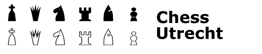
This chess font differs from usual fonts in that the symbols are not normal symbols from the alphabet or symbols like dots, commas, etc, but that the symbols are squares from a chessboard - possibly with a piece on it.
This allows you when using the font to make chess diagrams in a very easy way in programs that support True Type fonts: you just must type a set of characters, one for each square of the board, and some extra for giving the board a nice border.
This is the code that is used:
| When you type a: | You get a: |
|---|---|
| Q | A black queen on a white square |
| q | A white queen on a white square |
| W | A black queen on a black square |
| w | A white queen on a black square |
| R | A black rook on a white square |
| r | A white rook on a white square |
| T | A black rook on a black square |
| t | A white rook on a black square |
| N | A black knight on a white square |
| n | A white knight on a white square |
| M | A black knight on a black square |
| m | A white knight on a black square |
| B | A black bishop on a white square |
| b | A white bishop on a white square |
| V | A black bishop on a black square |
| v | A white bishop on a black square |
| K | A black king on a white square |
| k | A white king on a white square |
| L | A black king on a black square |
| l | A white king on a black square |
| P | A black pawn on a white square |
| p | A white pawn on a white square |
| O | A black pawn on a black square |
| o | A white pawn on a black square |
| / | An empty black square |
| A space | An empty white square |
| 1 | An upper border side |
| 2 | An right border side |
| 3 | An left border side |
| 4 | An lower border side |
| 5 | An upper left corner of the border |
| 6 | An upper right corner of the border |
| 7 | An lower left corner of the border |
| 8 | An lower right corner of the border |
Note that black pieces have upper case symbols, white pieces lower case symbols. For pieces on a white square, the used symbol is easy to memory: for all but the knight, it is the first character of the name of the piece; for the knight, it is the N. The pieces on a black square all are keys, neighboring the key for the piece on the white square on the keyboard.
For instance, the opening setup of a normal chess game can be made as follows: use this chess font, and type the following:
5111111116
3RMBWKVNT2
3OPOPOPOP2
3 / / / /2
3/ / / / 2
3 / / / /2
3/ / / / 2
3popopopo2
3tnvqlbmr2
7444444448
Advantages of true type fonts are that they are fully scalable. So, by choosing a proper point size for the text with the font, you can make the chessboard as small or large as you wish. However, this font doesn't look very good if the point size is too small (it might get unreadable) or too large (because the symbols are not very detailed, this may not look very nice.)
- The file. Use the save option of your browser.
- The file, zipped.
- The file, in sit.hqx-format for Mac-owners.
To install the font, consult the manual or on-line help of your operating system how to install fonts. Once you have installed it in an OS like Windows 3.X or 95, or OS-2, you can use it in most packages that support such fonts: these include programs like Wordperfect 6.X, Word, Wordpad, etc.
Remarks
Note the following:
- These symbols were not made by someone who is a graphical designer. In fact, much better looking chess fonts are commercially available. However, this font is free to use.
- The board doesn't look too good on a screen (at least, not on mine), but it prints out nicely when using a resolution of 600 x 300 dpi.
- In the future, the font will be extended by checkers pieces, and fantasy chess pieces.
- The font is based on some non-standard drawings of chess pieces. Especially, the bishop was highly simplified, and some of you may not like how I made it. Another similar chess font, based on more orthodox chess characters (probably modeled after some one-century old chess book) is planned, but this may take some time.
- Use of the font is free. While the copyright rests with Hans Bodlaender, you are free to use the font. Also, distribution is permitted, and you are permitted to ask a reasonable fee for distribution. Chess Utrecht font (c) 1996 by Hans Bodlaender.
- I named the font Chess Utrecht. Well, what's in a name?
- Feedback is welcome! Send your comments to: Hans Bodlaender.
- All trademarks are owned by their respective owners.
For more links, the Chess Marroquin font (made by Armando Hernandez Marroquin) and a checkers font, look to my main chess font index page.
Newspaper
The Sydney Morning Herald mentioned this font June 2000 in its `Icon' section. They wrote:Hans Bodlaender has done the world a favor and donated this TrueType chess font to cyberspace. (...) Hans - who's not a desiner - apologies for the quality, but it is actually very nice.
Legal information: I got an email with a form that asked me to sign it for a permission to cache and reproduce this webpage offline. Well, herewith I grant you all such a (non-exclusive) license, free of charge.
Written by: Hans Bodlaender. With thanks to Alastair Scott for permitting me to use his nice gif-picture of my font. Thanks to Mark Brooks for sending me the Chess Utrecht font in Mac-format, and to Peter Kooper for informing about the appearance of the font in the Sydney Morning Herald.
WWW page created: May 23, 1996.