Check out Glinski's Hexagonal Chess, our featured variant for May, 2024.


[ Help | Earliest Comments | Latest Comments ]
[ List All Subjects of Discussion | Create New Subject of Discussion ]
[ List Earliest Comments Only For Pages | Games | Rated Pages | Rated Games | Subjects of Discussion ]

Comments/Ratings for a Single Item

Earlier Reverse Order LaterLatest
Storm the Ivory Tower. A Smess adaptation of Chinese Chess. (9x10, Cells: 90) [All Comments] [Add Comment or Rating]
🕸💡📝Fergus Duniho wrote on Tue, Sep 9, 2003 02:07 AM UTC:
In all fairness, you do mention the two things I am dissatisfied with about
my game. At one time, I did change the colors of the Blue pieces to a
lighter shade, but when I was putting things together yesterday, I was
dissatisfied with that color. So I changed it back. The colors of the
board have been based on the colors of the Smess board. But I'll look
into what might be done.

The exit-moves of the Ninny and Yahoo are somewhat kludgy, but so is en
passant. I could have barred them from entering their own Ivory Tower, but
I don't want to violate the spirit of Smess by making some pieces ignore
certain arrows. I tried demoting them to a piece called a Sycophant, but
that didn't work well. I considered placing the arrows so that they
can't enter the Ivory Tower, but this would also prevent them from
entering the opponent's Ivory Tower. So far, exit-moves has been the best
solution I have to keeping the game from becoming too drawish.

Here's an idea I might try. Within their own Ivory Tower, Ninnies and
Yahoos cannot move at all, but they can be pushed by other pieces
belonging to the same side. While this might make for an interesting
variant, it veers away from both Smess and Chinese Chess. It would also
add to the complexity of the ZRF.

Anyway, something had to be done. Ninnies and Yahoos are normally trapped
when inside an Ivory Tower, and letting them inside your tower normally
weakens your attack and increases your defenses so much that the game
becomes very drawish.

Peter Aronson wrote on Tue, Sep 9, 2003 03:19 PM UTC:Excellent ★★★★★
This looks really good, Fergus. You've blended these two games such that they look as if they were meant to be blended!

One question: is a Yahoo allowed to move back to its starting square when the arrows allow for it, making a null move?

A comment about the 'Korean' Clodhopper -- following the analogy with the Korean Cannon, they should not be allowed to capture other Clodhoppers.

About the exit moves. I can see very easily how you ended up with them, and I for one like the forced exit rule, since it should make the game more decisive. An alternate approach if you did want to forbid them the tower in the first place would be to shade the arrows pointing into the tower, and add a rule that Ninnys and Yahoos may not follow a shaded arrow on their side of the board.


🕸💡📝Fergus Duniho wrote on Tue, Sep 9, 2003 11:34 PM UTC:
Here's what I'm thinking of doing now. When beginning a move within their own Ivory Tower, Yahoos and Ninnies must move against the arrows instead of with them. This would replace the exit-move. Any Yahoo move would automatically take it out, and any Ninny would be out in no more than two moves. This doesn't violate the spirit of Smess as much as arbitrary borders do, because I can envision a whole class of contrarian Smess pieces, which move against arrows rather than with them. I may make future Smess variants that include such pieces.

🕸💡📝Fergus Duniho wrote on Wed, Sep 10, 2003 03:41 PM UTC:
Peter, No a Yahoo may not double-back to its own space. When it moves, it moves to another space.

🕸💡📝Fergus Duniho wrote on Fri, Sep 12, 2003 02:48 AM UTC:
I have updated and clarified the rules concerning how Ninnies and Yahoos move. I have changed the blue color of the blue pieces to royalblue. This helps makes the features of these pieces easier to make out. I think the real problem with the blue pieces was that the blue was too dark to contrast well with the the black drawing.

Anonymous wrote on Mon, Aug 16, 2004 05:22 PM UTC:
Under the description of the Brain, it says:<br> 'Since Brains are never captured, this works much like the rule against opposing Kings in Chinese and Korean Chess.'<p> However, in the description of Korean Chess, under the rule against opposing Kings, it says:<br> 'If you cause this to happen in Korean Chess, you are placing the other General in check in a desperate last-chance move on your part for you irreversably foresake the right to checkmate the other side--you are hoping for a stalemate, which would be the case if the other side can not get out of that desperate check.'<br> As such, this <b>is</b> allowed in Korean Chess.

Charles Gilman wrote on Sun, Dec 11, 2005 10:10 AM UTC:Excellent ★★★★★
The change to the squares to keep Ninnies out of the Ivory Tower is a great improvement on previous arrangements, particularly as it echoes a practical consequence of Xiang Qi rules. Seeing this updated soon after A. Black posted his Color Square Shogi makes an interesting contrast in ways to generalize directions.

Gary Gifford wrote on Mon, Dec 12, 2005 12:01 AM UTC:
I would like to see an additional board and piece set option for for this game. One that had a much less colorful board and used subtle direction indicators instead of bold colorful arrow displays. Otherwise, though it is a logical and challenging game, it looks too much as though it is for children. And pieces: I would have trouble getting into the comic, big-eyed pieces, whereas Chinese or Alfaerie-Stanton Style pieces would seem more fitting to an engineer, scientist, lawyer, etc. A similiar situation exists with the related game 'All the Kings Men.' I own a board and set (plastic pieces), which is the 'adult' or 'grown-up' version. But I saw photos of a children's version. For me, personally, I like the adult set, but would not want to play on the child's set. Of course, this is all visual perception, and visual preference. But picture Kasparov and Topalov, for example, playing a serious chess match on a Scooby Scooby Doo set or a Simpsons set. It would be the same game, but ... somehow not quite right.

🕸💡📝Fergus Duniho wrote on Mon, Dec 12, 2005 03:07 AM UTC:
If you want to make the board, I'll see what I can do about using it. The board should be made to the same dimensions, 540 x 600, and arrows should be visible even when a piece is on the space.

Anonymous wrote on Mon, Dec 12, 2005 03:07 AM UTC:Excellent ★★★★★
Actually, I like the colorful board and pieces. The theme wouldn't make sense without them.

Sam Trenholme wrote on Mon, Dec 12, 2005 10:56 PM UTC:Excellent ★★★★★
I have a black and white version of the board here:

http://www.samiam.org/new-ivorytower9x10-bw.bmp

- Sam

🕸💡📝Fergus Duniho wrote on Mon, Dec 12, 2005 11:58 PM UTC:
All you've done is strip away the color from the original board. It still has the bold arrows Gary was complaining about, and it no longer distinguishes spaces by color.

Gary Gifford wrote on Tue, Dec 13, 2005 01:05 AM UTC:
As Fergus has pointed out, Sam Trenholme's black and white version
consists of arrow outlines... with the squares not defined by borders or
colors.  But I think if these were added to basic color squares (as used
in most chess setups) we would have a board similar to that of the 'All
the King's Men' game, which has imitation wood and noticeable, yet much
more subtle arrows.  Note that I was likely spoiled by the physical board
I own and the 3D plastic medeival-type pieces that came with it.

Perhaps, most important here, is the fact that [other than myself and a
co-worker] I know of no one else who minds the bright colors and the
current piece set with eyes.  So, as the Star Trek Spock once said, 'The
needs of the many outweigh the needs of the one or the few.'  So there is
certainly no need to create a second board and piece set on my account,
that would be a waste of time and space. But I do thank Mr. Trenholme for
taking the time to create and present his black and white bitmap.

🕸💡📝Fergus Duniho wrote on Wed, Dec 14, 2005 02:54 AM UTC:
I got the graphics. I do not share your estimate that they are excellent, but I'm not exactly your target audience, since I prefer Smess graphics anyway. I should be able to make use of the board after recoloring it. As for piece graphics, I already have that covered. I have already made plenty of different sets for Chinese Chess, both western and Chinese, and they can easily be employed for Storm the Ivory Tower. I am currently working on redrawing the pieces for the game, and when all is ready, I will package everything up with a single ZRF that gives players a choice of graphics.

🕸💡📝Fergus Duniho wrote on Wed, Dec 14, 2005 04:22 AM UTC:
On further inspection, I have to conclude that Michael's board is unusable. The problem is that it is creating optical illusions. Instead of using arrows, it uses little solid borderless black triangles. Because they're small and have no borders to define what they are, my eyes switch back and forth between seeing the triangles and seeing the shapes formed by the space between them. For example, the squares with the four diagonal directions sometimes look like octagons instead of squares with triangles in the corners. To see the triangles in any individual space, I have to focus right on that space, and the uniformity of the triangles makes that all the harder. Furthermore, the uniformity of the triangles creates global optical illusions. Instead of easily focusing on individual spaces, as I do with the Smess style board, my eyes focus on various patterns created by the overall arrangement of triangles. To avoid optical illusions, the board should use arrows with borders, not small borderless triangles.

Anonymous wrote on Wed, Dec 14, 2005 12:39 PM UTC:
'On further inspection, I have to conclude that Michael's board is unusable'

Perhaps for some, but that's not a valid statement because it is unconditional. I had a very successful experience playing STIT last night using my graphics, the first time I was able to play the game to completion. I personally find the Smess-like graphics unplayable.


🕸💡📝Fergus Duniho wrote on Wed, Dec 14, 2005 05:56 PM UTC:
If you like it, go ahead and use it for yourself, but don't distribute it with a modified ZRF. I am not interested in playing semantics over my evaluation of your board. Even if you happen to be immune to the effect, it is a very serious problem when a board tends to induce optical illusions. The bottomline is that I will not have any optical illusion inducing board included with any of my games. As for your prejudice against Smess-like graphics, it is irrelevant to the matter at hand. I am willing to include a dulled down set of graphics for this game as long as it has no technical problems such as inducing optical illusions.

Tony Quintanilla wrote on Wed, Dec 14, 2005 06:39 PM UTC:
To Michael Howe: Michael, you have been a valuable contributor to these pages for several years. You have contributed, games, ideas, played in tournaments, provided Zillions files. Please re-consider your request to remove all your contributions. As an editor, I would do this with extreme reluctance -- and great sadness. This chess community is much larger than issues related to one game, or one project. It is also larger than the persons involved in one discussion. Please reconsider. Remember that you are welcome here by many people. (Friends, please support my appeal.) Best regards, Tony Quintanilla.

Tony Quintanilla wrote on Wed, Dec 14, 2005 11:42 PM UTC:
Michael, I was thinking of Antoine Fourierre's game, 'Chess on a Larger Board with Not So Few Pieces Dropped.' Sorry about the incorrect reference (removed). However, my other comments remain. I have followed your interesting comments and contributions on many games and topics (such as Nova Chess), and still hold those opinions. David Howe is an excellent contributor and our chief editor, however, I was, in fact, thinking of you, not David. Also, with regard to amending/deleting non-relevant comments on this page, I would agree they could/should be removed, but you should initiate the changes by editing your comments with your member password. Thanks.

🕸💡📝Fergus Duniho wrote on Thu, Dec 15, 2005 04:13 AM UTC:
Michael,

I have long known you as someone who has his head on his shoulders, and
you have long been one of the members of this site I hold the highest
respect for. I still believe that you are that person I respect, and I
will just assume you are having a bad day. I do appreciate that you went
to the trouble to make my game more accessible to people who may not like
my Smess graphics. I do not mean to be cold, but I do tend to be blunt and
to the point. In this particular matter, I could not be very encouraging,
because I was never excited over the idea of replacing my Smess graphics
with something more 'classic.' As for constructive feedback, I did give
that. I carefully explained how the board induced optical illusions and
gave specific recommendations on what to do to fix this.

Daniel Roth wrote on Thu, Dec 15, 2005 05:56 PM UTC:
Where is this so called 'unuseable' board from Michael Howe? I would like to have a look at it before I will comment anything.

🕸💡📝Fergus Duniho wrote on Thu, Dec 15, 2005 10:35 PM UTC:

Michael, please send me your new board. I would like to include an alternate board if it doesn't induce optical illusions.

For those interested, here is Michael's original board. I converted it to PNG for viewing on the web. If you want to use it with my ZRF, you can convert it back to BMP and edit the ZRF to use it.


Roberto Lavieri wrote on Thu, Dec 15, 2005 11:24 PM UTC:
I have not played Smess, neither Storm the Ivory Tower, but I have some problems with my vision and by this reason I have some troubles visualizing, in a good manner, both boards, although some simplicity and high contrast with colors of the pieces would be a bit better for my case. My eyes are far from 20/20, these games can produce me headaches, so I try to avoid them, unfortunatelly, regardless they look interesting.

Gary Gifford wrote on Fri, Dec 16, 2005 12:28 AM UTC:
Thanks for displaying Michael's board, it is much easier for my brain to quickly see what's going on directionally. But I am wondering if a checkered version would be a further improvement? [The colors used on the Switching Chess pre-set, I think, would be very good] I think it would reduce the optical illusion factor (which if I stare at the board a while I do see). Anyway, given the choice of the two boards I greatly prefer this one. But what pieces would go on it? Chinese ? Thanks again to both Michael and Fergus for putting the effort into getting an optional, more traditional board and set. P.S. One reason I don't like the current set and board can be realized if you picture a book of chess problems. Now, imagine a similar book with STIT problems using the current board and pieces. I solve chess problems in my head every night, many quite fast... but the nature of the STIT board and pieces would require that I analyze the STIT diagram a long time just to understand what is where. Plus those little eyes and comic images, well I have trouble taking them seriously.

Mark Thompson wrote on Fri, Dec 16, 2005 01:00 AM UTC:
I also prefer the 'optical illusion' board. I prefer plain things over garish. And the idea of checkering it sounds very reasonable to me too.

🕸💡📝Fergus Duniho wrote on Fri, Dec 16, 2005 01:33 AM UTC:

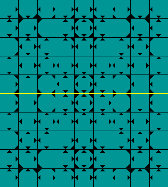
Here is a recoloring of Michael's original board that I like much better. One trick I found helpful for reducing the tendency toward inducing optical illusions was to checker the board AND make the triangles the same color as the other color of square. I used black triangles in the Ivory Tower for better contrast. Another helpful trick was to combine the board with a marble background to give it texture. This helps the eyes to better distinguish each square. I converted it a JPG to display on the web.


Gary Gifford wrote on Fri, Dec 16, 2005 02:19 AM UTC:Excellent ★★★★★
Outstanding! Great job Fergus! Now this board, a coloration of Michael's submission is a true work of art, fit for framing. Thank you very much Fergus for creating this version. And thank you Michael for designing the original. When it has complimentary pieces to go with it I'm fired up to play!

Larry Smith wrote on Fri, Dec 16, 2005 02:30 AM UTC:
My vote is for the original Smess-style playing field.  Please keep it.

You might offer that alternate field in the ZRF, if you wish.

My conspiracy antenna is giving me the signal that all this might be a
New_Coke/Classic_Coke propaganda ploy.  Push out a revised product to
create controversy and get lots of public attention then revert to the
original under the illusion of responding to public demand. 

Nah! No-one would ever do that! Would they? ;-)

Thomas McElmurry wrote on Fri, Dec 16, 2005 02:39 AM UTC:
I rather like the whimsical, hyperactive feel of the Smess board and of the Smess-style board Fergus has created for Storm the Ivory Tower. I haven't played the game yet, but I expect that this board would add to the experience in one way, by giving it a unique flavor, but detract from it in another way, as the loud colors and diverse styles of arrows might make it hard to see several moves down the game tree. (But perhaps playing a few games would help me to understand the structure of the board better, so that I wouldn't have to rely as much on the visual representation.)

I also like the more minimalistic look of Michael's board. I don't think I would have any trouble playing on this board. I can see where Fergus is coming from, though; I wouldn't call them optical illusions, but in some parts of the board the patterns formed by the triangles are noticeable. Some of these patterns have their own kind of beauty, and to my eyes they don't obscure the squares, but I can easily understand how some people could find it hard to play on this board, just as others find it hard to play on the Smess-style board. My own opinion is that Fergus's board is more fun to look at, but Michael's would probably be easier to play on.

As I write this I've just noticed Fergus's recoloring of Michael's board, which I like very much. The checkering helps a great deal (more than I expected), the texture gives the board life, and the colors are very well chosen. And it preserves the elegant simplicity of Michael's design.

If there's any interest in yet another StIT board, I think it would be nice to have one in the style of All the King's Men, which I think in at least two ways would be an appropriate complement to the Smess-style board. In All the King's Men, the squares resembled a wooden floor, and the arrows had a simple, uniform style, easy to see but not distracting. Iff Fergus and others are interested in having such a board, and if no one else wants to create it, I would be willing to try my hand, although I probably won't have the time until after New Year's Day.

BoardGameGeek's Smess page has some nice images of various editions of Smess, Take the Brain, and All the King's Men.


🕸💡📝Fergus Duniho wrote on Fri, Dec 16, 2005 04:35 AM UTC:

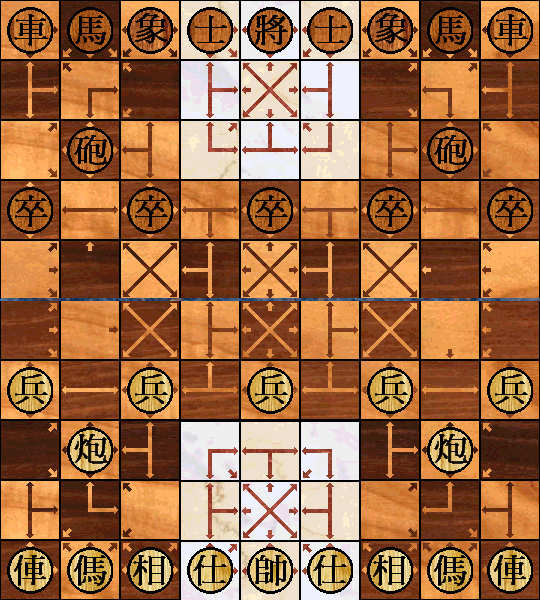
Here is a recolored redesign of Michael's latest board. His board used small arrows in place of the triangles. I drew lines between some arrows, then recolored it. It uses wood (maple and walnut) for most of the board and marble for the river and Ivory Tower. I think it looks best with the Big5 Chinese set shown in this screenshot.


🕸💡📝Fergus Duniho wrote on Fri, Dec 16, 2005 04:49 AM UTC:

Michael Howe wrote:

My personal preference at the moment, though, is still my tan-squared board with little black arrows, although now I'm considering giving it the same color-treatment. I doubt that I can do the texturing, though, with the simple software I use to make graphics.

You don't need to. Once I did the triangle board, it was simple enough to apply the same process to the new board. Here is the result. BTW, the graphics program I use is Ultimate Paint, a fairly inexpensive shareware program.


Gary Gifford wrote on Fri, Dec 16, 2005 10:45 AM UTC:Excellent ★★★★★
Excellent again! Michael's tan board is very good. Much like my physical board for 'All the King's Men.' Very easy on the eyes. Fergus's Chinese pieces look good on this board. I am curious as to what Michael's pieces look like and will ask for a copy via e-mail, unless there are plans to display that scenario here. I greatly appreciate the time and effort Michael and Fergus have put into this project. In regard to the 'New Coke' hype idea... I can say, 'Nonsense.' We are talking about game design here. Two very different boards and very different piece sets as an attempt to please players with different tastes. The fact that this gives a great new game publicity is an added benefit. Anyone not liking the STIT comments, of course, can skip them. But I think they have lead (or are leading to) to a very worthwhile conclusion. I look forward to seeing the game logs for STIT. Best regards to all. And thanks again... very much.

🕸💡📝Fergus Duniho wrote on Fri, Dec 16, 2005 04:42 PM UTC:

Here is my latest version of the board. I have added more connecting lines between arrows. These eliminate the problem of optical illusions without resorting to texturizing the board. They give each space a specific shape that helps define the terrain of the board. This allows for a board with simple colors and good contrast. I have also eliminated the lines between spaces, which are important only for a monochrome board, such as the ones Michael originally made. I will be using this board as a template for textured boards, since such boards still look nice and work better with certain piece sets.


🕸💡📝Fergus Duniho wrote on Fri, Dec 16, 2005 05:03 PM UTC:
I'm glad you like it. I like it too. Thanks for your help in making this possible.

Jared McComb wrote on Fri, Dec 16, 2005 07:06 PM UTC:
I think it would look best with the colors of the wooden one, but without
the texture.

Just my two cents.

Anonymous wrote on Fri, Dec 16, 2005 07:17 PM UTC:
Classy. Good pictures. Nice resolution. Thanks.

🕸💡📝Fergus Duniho wrote on Sat, Dec 17, 2005 04:03 AM UTC:
I've now uploaded an updated zip file with alternate piece sets and boards for the ZRF. These include the last board I showed here plus two more, one being similar to another board I showed earlier. The new piece sets include Big5 Chinese, GB Chinese, Western Chinese, Eurasian, and Alfaerie. I have recolored the Smess-style board for better contrast and visibility. The blue arrows are now violet, which is actually closer in color to the arrows on my Smess board, and the yellow squares and green arrows are a bit darker to reduce glare. I have renamed the Dumbo piece the Fuddy-Duddy, I have redesigned the Clodhopper, and I have redrawn the whole Smess-style piece set for consistency of style. In case I want to change anything later, I'll wait for feedback before sending this updated zip file to Zillions of Games. I'll work on new Game Courier presets tomorrow.

Thomas McElmurry wrote on Sat, Dec 17, 2005 07:19 AM UTC:
The only thing I would recommend changing on the latest board would be to extend all the arrows to the centers of the squares. On squares with both long and short arrows, the long ones are more prominent, and this may make it easier to miss the short ones.

I like the new Clodhopper and Fuddy-Duddy pieces in the Smess-style set. I preferred the name Dumbo, though, as it seemed so perfect for a piece based on the elephant. Fuddy-Duddy makes some sense too, but I've known ministers who are anything but dull, conservative, and unimaginative.


Jared McComb wrote on Sat, Dec 17, 2005 03:43 PM UTC:
But but but... the big-eared person with a tie over his nose was just so charming!

(zzo38) A. Black wrote on Sat, Dec 17, 2005 07:10 PM UTC:
I like the Dumbo guy with a tie on his nose.

I also think that the arrows should be extended to the center of the squares

🕸💡📝Fergus Duniho wrote on Sat, Dec 17, 2005 07:46 PM UTC:
One of my reasons for changing the name of the Dumbo is that I would like to lease or sell this game to a game company, and I don't want to worry about the Disney trademark on the name Dumbo. Also, its ears covered up some of the arrows on the squares the blue Dumbos started on.

🕸💡📝Fergus Duniho wrote on Sat, Dec 17, 2005 07:59 PM UTC:
I'm certainly not saying that all ministers are dull, conservative, and unimaginative. At best, I will make the I statement that some ministers, maybe even many, are fuddy-duddies. I can't say I've ever actually met any. I haven't met any ministers of the political variety, since minister is not even a political title in the U.S., and the religious ministers I've met haven't seemed especially fuddy-duddyish. It's mainly a stereotype I pick up from the media, such as Rev. Lovejoy on the Simpsons.

🕸💡📝Fergus Duniho wrote on Sat, Dec 17, 2005 08:16 PM UTC:
I did try extending the arrows on all squares, but some seemed to work better without extended arrows. In general, I avoided connecting orthogonal and diagonal arrows. I wanted lines to connect arrows mainly at 90 and 180 degree angles, so that a line would be a visual cue for a related pair of directions. In the center squares, extending all lines made the center point too fat. On h9, extending the diagonal line looked a bit too phallic. On other squares, extending lines made things a bit too crowded. The small arrows on b5 and h6 fit better with the small arrows on a5 and i6, and those on b6 and h5 looked better for matching b5 and h6. I haven't had any problem noticing the remaining small arrows. This may be because I am already familiar with the configuration of arrows used in the game. As you play it, you may become more familiar with the configuration of arrows too.

🕸💡📝Fergus Duniho wrote on Mon, Dec 19, 2005 03:06 AM UTC:

Here is a board sent in by Larry Smith. Thanks, Larry. I renamed it and fixed the coloring of an arrow on one square. I am working on using this board as material for new alternate boards.


🕸💡📝Fergus Duniho wrote on Mon, Dec 19, 2005 03:12 AM UTC:

Here is how Larry's board looks with the Smess-style board's colors. Maybe some people would appreciate something like this with different colors.


🕸💡📝Fergus Duniho wrote on Mon, Dec 19, 2005 03:34 AM UTC:

Here is one possible recoloring of Larry's board. I added the moats back in to better distinguish the ivory squares from the neighboring light squares.


Tony Quintanilla wrote on Mon, Dec 19, 2005 06:06 PM UTC:Excellent ★★★★★
Very nice graphics, indeed. Perhaps both the Smess and the recolored options could be provided.

Larry Smith wrote on Wed, Dec 28, 2005 03:28 PM UTC:Excellent ★★★★★
I had thought that I had previously rated this game. But after reviewing
all the comments here, I discovered otherwise.

I remember when a friend of mine dragged out a Smess game and tortured me
with it.  I was a fan from that day.

So when this XiangQi extrapolation of Smess appeared I was definitely
intrigued.  I suspected that the dynamics of each of these games would not
mesh well.  And the early version did have a few minor problems. This could
be the reason that I did not post an evaluation.

Now that the game has gotten a facelift, I took another look.

What can I say but 'Wow!'  Very nicely done.  The overall play of the
game appears to be quite nice. The various pieces interact very well with
the pattern of directions.  Now East Asians can enjoy the Smess
aggravation.

Here's a question: Is the name 'Smess' derived from 'It's a mess'?

🕸💡📝Fergus Duniho wrote on Wed, Dec 28, 2005 05:10 PM UTC:
It might be. I have always noticed that the name Smess contained the word mess. But there is also the practice of mocking certain words by replacing the beginning consonants with 'sm' or 'schm.'

49 comments displayed

Earlier Reverse Order LaterLatest

Permalink to the exact comments currently displayed.