Comments/Ratings for a Single Item
 Ben Reiniger wrote on Thu, Aug 27, 2015 04:04 AM UTC:
I was just noticing the same thing! The menu text also seems too large on
my mobile. I will try to help where I can, probably just sending you code
snippets.
- I removed the sidebar from the What's New? page for mobile devices.
- I removed the Share applet from the header on mobile devices
- I changed the menu for the main site to work like the one in the Play subdomain.
- I put the ad code into a function, so that I could put it in a different place on the page for mobile devices. On mobile devices, the menu now appears to the right of the logo, and the banner ad appears underneath both.
- I also rewrote the ad code as a switch statement to make it easier to follow.
On my cell phone, using Boat Browser, the text on the What's New? page is now fitting the screen properly, but the banner ad and the form at the bottom get cut off for being too large, and I have to scroll the screen right to see the rest of them.
- I replaced the table form on the Game Courier Logs page with some DIVs that will flow on a desktop or lineup on a phone.
- I tweaked the CSS for forms in Game Courier.
- I got rid of comments on the mobile versions of pages in the Play subdomain, leaving a note that they can be viewed on the desktop version.
- I got rid of the piece set table in Game Courier for mobile pages.
Getting rid of big things that take up too much width serves the double purpose of keeping the page from shrinking its contents too much and of saving bandwidth, which is a concern when using a mobile device that's charging for data. It also saves me the trouble of writing code for compacting these things on a mobile device.
The main cause of width now will be multi-column tables on individual pages, wide images, and comments on member-submitted pages.
Would it be better to stop using multi-ciolumn tables with a view to suitability for mobile phones? If so, I will have to change quite a few of my pages.
If you have to make a choice between multi-column or single-column, I would recommend single-column, because multi-columns are harder to read on a phone than single columns are on a widescreen monitor, but it's not necessary to make that choice. You can have multi-columns on a wide screen and single columns on a phone by replacing TABLEs with DIVs that are designed to fill multiple columns on a wide display but to stack up on a narrow display. Technically, a DIV would replace the TD in the table, not the whole table. I have done this on the Game Courier homepage. On that page, I have used the CSS classes DIV.left and DIV.right to align DIVs. On a wide screen, they show up parallel to each other in two columns, thanks to this CSS code:
DIV.left {width:49%; float: left; }
DIV.right {width: 49%; float: right; }
But on a narrow screen, they stack up, thanks to this CSS code:
@media all and (max-width: 1506px) {
DIV.left {width: 100%; clear: both;}
DIV.right {width: 100%; clear: both;}
}
You can determine what the max-width value should be by calculating how much space is required to display both columns side-by-side.
It's also best to keep the maximum width of each column at or below what would fit on a phone screen. Theoretically, this is 480 pixils, but the diagrams on the Shogi page are under that in width yet still appear wider than my phone's screen when I look at that page. I'll report back after I've fixed that page for mobile screens.I fixed the Shogi page to fit on a phone. I did a few things. The one I did globally was to add this code to the header file:
IMG {max-width: 100%;}
This will make banner ads and other large images fit the screen without making the text too small.
On the Shogi page itself, I reduced the pieces table to two columns by putting piece images and the description into a single column. I also put the two diagrams into a diagram class, which is defined like so:
@media screen and (max-width: 480px) {
IMG.diagram {width: 100%; height: 100%;}
}
And I put the diagrams in DIV.left and DIV.right containers, defined like so:
@media all and (min-width: 1110px) {
DIV.left {width:40%; float: left; margin: 5%}
DIV.right {width: 40%; float: right; margin: 5%}
}

@media all and (max-width: 1109px) {
DIV.left {width: 100%; clear: both; float: none; margin: auto;}
DIV.right {width: 100%; clear: both; float: none; margin: auto;}
}
I have checked the page with Android's default Browser, Boat Browser, Chrome, Dolphin, Firefox, and Opera, and it works fine in all of them with minor glitches in some. In a few, the diagrams get stretched vertically, though this is actually appropriate for Shogi. And in a few, the sidebar appears above the rest of the text instead of beside it.
Ben Reiniger wrote on Wed, Sep 2, 2015 08:30 PM UTC:I have modified the display of comments in such a way that mobile devices should be happier. What does "List just summaries" do? What are summaries?
Ben Reiniger wrote on Thu, Sep 3, 2015 12:19 AM UTC:I tweaked the menu a bit so the Favorites menu shows up correctly on my mobile (made it a touch wider). I've also added (again) some links to the Info tab. (Fergus, have you seen my emails?) Also, I modified the "List all subjects" page to give names to the post-2012 topics that have hexadecimal codes as their subjectid's. I have hidden some of the administrative tools in the footers as well. They are visible only when the currently logged in user is an Editor.
It looks like I have one email from you from 2011 and no others. Maybe
SpamAssassin is killing your emails.

While your changes to the comments would look better on a cell phone, they
don't look better on a widescreen monitor. Reading is more comfortable
when the width is narrower. I can just resize the window when reading
comments, though I would consider defining a content area that stays within
a certain width, such as Wordpress blogs do. I could probably add a bit of
CSS that limits the width of the BODY element, add an attractive Chess
variant themed background, whose edges would show up in wide screen
monitors but not in phones.

I think "List just summaries" is supposed to cut long comments short and
provide a link to read the rest. I remember this happening a lot, but I
didn't find any recent examples of this. I knew I found this annoying, and
maybe I changed it, but I don't remember for sure. If I did change it, I
could have done so without changing the options given to the user, since I
didn't write the original code and didn't think about the options given
to the users.
Ben Reiniger wrote on Mon, Sep 7, 2015 05:46 PM UTC:Fergus, my email to you in 2011 was from my general email address; after becoming an editor here in 2013 I started emailing you from the address listed in my Personal Information page. I can see what you mean about the width of the comments. (I noticed it when I made the change, but dismissed it.) I could enforce a max-width, but if you want to design a nice background for the resulting margins then I'll leave it to you: design is not my thing.
Ben,

I just sent you an email from another address you can reach me at.
12 Sharp Chess;
16 Seasons;
2 Jewels;
2 Level Guru Mahachaturaji;
3 Level 4 Player variants;
3 Player Honeycomb;
4 Faces;
4 Linepiece Fusion;
Armies of Faith 1/2/3/4/5/6;
BacCanCat;
Brookschach;
Chaturanga with minor changes;
Commedia dell'Arte Chess;
Compact Hex;
Cornucopia;
Courier Leapale;
Crossover-piece Dual-dircetion variants;
Crouching Stepper... ;
Diamond Ring Chess;
Double Cross Besiege;
Fimbriated Chess;
Flyover Xiang Qi/Shogi;
Gutenschach;
Half Nearlydouble;
2 and 3 dimensional Herichess;
Hourglass Hex Chess;
Irwell;
Larger Wildeurasian Variants;
Lengthleaper Chess;
Mini Fivequarters;
Mitred Framing 1/2/3;
Nested Chess/Xiang Qi/Shogi;
Notchess;
OctHex 146;
Pass Variants;
Proto Prelates;
SerPent;
Shoxiang 108;
Small Game Nearlydoubles;
Stock Goes East 49 Files;
Taijitu Qi;
Tardis Taijitu;
Tee Garden Shogi;
Tetrahedral Shogi;
Turn Qi;
Twin-board Ecumenical Chess;
Weltschach;
Westfield Chess;
Yo[n]o Shogi;
Yoto.
Any of you who have seen these in the old form and dismissed them as badly designed might wish to revisit them now that the tabulation issue has been ironed out.
Using a single image for a diagram instead of a diagram made from
individual components with JavaScript will make your pages more shareable
on social media, particularly Pinterest.
Of course doing multi-image diagrams raw has its costs as well, which is why I emphasise stored. That is where ffen diagrams come in, as regards traditional computing. As far as the HTML document is concerned it is a calculated image, taking up not much more space in the text of the page than a single image but without an image file's use of memory outside the text of the page either. As far as a large enough screen is concerned they also behave like a single image, at least if nothing else is on the same line, and desktop monitors have been getting bigger all century. The problem is how they behave on the mobile devices to which this thread's title refers - and I am guessing that Ascii Art is not very mobile-friendly either.
Now there are various facilities for playing many of the variants on these pages, and I would be surprised (and indeed disappointed at the capabilities of programming) if they generated an image file for every position that ever came up. In terms of more typical programming, It would be the equivalent of every control on a Visual Studio form replicating the entire definition of tha control. What I do not know is how the playing facilities stand up to use on a tiny screen. If they can be made to behave as single images even on-screen, surely something can be done somewhere along the line that can be done to make ffen diagrams do so as well. It would be a shame to lose such a useful shorthand for want of it functioning on mobile devices.
H. G. Muller wrote on Sun, Nov 22, 2015 12:38 PM UTC:BTW, I noticed this morning that on my wife's tablet (a Samsung Galaxy running Android) the menus on the top of this all webpages here do not appear.
I checked on my Android phone and my Android tablet with the default browser, and the menus worked fine in both. One thing to remember is that the menus change appearance on mobile devices. While you have a menubar on a desktop, the mobile version puts an ≡ sign in the corner. Click on that for the menu. As long as she is using a tablet, there is also the option to view the desktop version of the page.
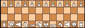
Displaying diagrams with multiple images does not work well, especially on phones. First, here is a screenshot of 12sharp Chess, as displayed in Firefox on my desktop.

Notice that the top two ranks are misaligned. As bad as that is, it gets much worse on my phone. Here is a screenshot taken on my Android phone with the default browser.

A single image has the advantage of maintaining integrity, no matter what device you display it on. At worst, it will display too small or too large, which is easily corrected on a mobile device by resizing the screen. But when displayed as multiple images on too small a device, multiple images get broken up, which garbles the diagram.
Game Courier provides multiple methods of rendering diagrams. Some use a single image, and some use multiple images, but when they do, they use a table or CSS to position everything. These scripts you use for your diagrams do not do this. They just display images and leave it to the browser how to align them.
Ben Reiniger wrote on Sun, Nov 22, 2015 09:42 PM UTC:So I should try to modify those scripts. Ideally it would shrink all the
images (equally) in the case of a very large board on a mobile screen, but
I'm not sure how to accomplish that. Any ideas?
Also, I was thinking about redoing some of msdisplay; specifically,
removing the {pre} tags from submissions "Not using HMTL" and inserting
paragraph breaks using a script similar to what Fergus added for comments.
The main problem with that is ASCII diagrams: unless I make them use a
monospaced font they won't line up, and wide ASCII diagrams could
break over lines on small displays.No, resizing images is not the way to go. It could be done. Game Courier can already handle resizing of diagrams, whether they are made with one image or multiple images. But resizing images will not fix problems with alignment, and it is not a guarantee against the images breaking up. I would like to replace these scripts with ones that use JavaScript to draw a single image with a canvas element. This should still use the same images as the current script, but it would create a single image that wouldn't break up or get misaligned. Nevertheless, I would prefer over this a transition to single images hosted on the site. This makes pages more shareable through social media and may improve SEO. JavaScript generated diagrams are useless for this. As for fixing up msdisplay, anyone who inserts an ASCII diagram should always put it between PRE tags himself. So I'm in favor of not using PRE tags. Besides that, ASCII diagrams are so 90's. They are ugly and harder to read than graphic diagrams. So we shouldn't do anything to encourage them. What I think I would like is to replace msdisplay with a more sophisticated content management system. In particular, I want it to handle metadata for SEO and provide friendlier URLs. Maybe we could modify msdisplay for this, or maybe we could switch to a dedicated CMS program, assuming we can find a way to migrate the data.
Ben Reiniger wrote on Mon, Nov 23, 2015 04:50 AM UTC:I was hoping for a solution that would scale images enough so that lines were not broken. (Alignment for boards with different rank sizes is another issue, which I had not considered yet.) I was looking for a way that the js output could be treated as a single object to be scaled to fit the screen; perhaps flattening to a single image would do that in addition to being better for other reasons. By "transition to single images hosted on this site" do you mean on the author's end? For ASCII diagrams I am mostly concerned with old pages (90s ones :P) that already use them (and whose authors might no longer be active). I suppose changing msdisplay to add P tags and a monospace font will make any "non-HTML" page without an ASCII diagram better on mobile, and will make such pages with a wide ASCII diagram bad on mobile, but just in a different way than at present. I had thought about introducing a more sophisticated text entry method (e.g. CKEditor or TinyMCE), which could render "Uses HTML" obsolete (for future pages): every page would use HTML, but the user wouldn't need to worry about coding. On top of that, we could be a little more careful about what we allow our users to submit (whitelisting html elements and customizing to allow Muller's [diagram], the ffen2diag script, etc.). If we think we want to and can manage to move to a third-party CMS, then I won't keep looking into this. (This is outside my tech comfort zone, so it would take me a while anyway.)
H. G. Muller wrote on Mon, Nov 23, 2015 09:38 AM UTC:The problem with the ffen is that the diagram is generated as a HTML list, with each list item a row of piece images. If there is not enough space, browsers start wrapping such lines, or mutilate them otherwise. HTML tables seem more robust against browser mutilation. At least if their cells contain 'incompressible' images rather than text. When they don't fit the browsers tend to use scrolls, rather than attempting to shrink them. When I display my interactive diagrams on very cramped mobile dislays, like phones, however, the browsers still don't seem to be able to resist shrinking the size of completely empty ranks and files to below the specified pixel size. I guess this can be cured by providing a full-size image of an empty square, completely transparent, and using that everywhere. Currently I just leave empty squares without any content.
Maybe we don't need to switch to a third-party CMS. We have code here that is already set up for Chess variants, and it might be hard to duplicate or integrate that with a third party CMS. But we could use some new features. I don't use msdisplay much since I can upload html pages, but looking it over, it seems very bare bones. Here are some features I think could help improve it:
- A WYSIWYG editor
- A more sophisticated HTML editor
- Buttons for inserting common HTML code
- An easy way for users to upload images
- Fields for metadata, particulary title, description, keywords, and an image to use with Open Graph metadata and Twitter cards.
- A reference to Game Courier and the graphics.dir directory as resources for making diagrams and displaying piece images.
- Maybe replacing msdisplay.php URLS with /user/userid/ or /category/category_name/ or /userid/category_name/ URLs.
On the Game Courier end, I'm thinking of adding the ability to selectively save Game Courier generated images to a user directory for permanent use on a webpage. This might spare the need to allow users to upload images, keeping people from using the site for general image hosting.
With regard to limiting HTML code, what did you have in mind? Any further thoughts on features msdisplay could use?
25 comments displayed
Permalink to the exact comments currently displayed.