Comments/Ratings for a Single Item
No, I'm referring to the refresh button, not to the back button. It should be on or near your address bar.
Are you referring to the Back (or also [smaller] Forward) button on the upper left of my browser, Fergus?
If so, as a user I still have to go somewhere from the CVP main page, e.g. click on "Comments", then use the back button (or the small CVP logo that shows on the Comments page, anyway). Not hard, but now a two click mouse process anyway - also perhaps not entirely intuitive for anyone just visiting CVP for the first time. If I'm right about all that, I think it might be an idea, if only for such people, to add a "Home" item to click on on even the main menu of the CVP main page (unless a small CVP logo is put back on it instead, which you may not wish to do).
Kevin
Your browser should have a button somewhere that looks like an arrow curved into a circle. That will refresh whatever page you are on.
Unless there's a way to refresh the CVP main page with one mouse click, hopefully a small logo will be added to the CVP main page again soon, if some other remedy isn't used (I suppose since CVP is on my website favourites list, I can use that as one lazy man's workaround instead - though in my case there's 3 mouse tasks needed for that).
[edit: I see now that on the CVP main page, one can use the scroll bar to get to the point where one sees the link "Top of Page"; I guessed clicking on the link would refresh the main page. Not entirely obvious, perhaps, and still two tasks, if one counts using the sidebar.]
[edit2: I see that clicking on "Top of Page" does not in fact refresh the CVP main page ("Minutes" on e.g. 'Comments' still show same number, i.e. for time elapsed).]
I would not object to the site using the name of one of my Games in the logo or somewhere, this being Kaleidoscope.....the site might then have "The Chess Kaleidoscope" or similar, such as "A Kaleidoscope of Chess".....But I am still quite happy for others to decide on such matters, as long as Kaleidoscope was used in a reasonable way, as I'm sure it would be.
If you want to continue the discussion of what is a Chess variant, there is a page on the subject.
I have now added CSS that uses the small logo when the screen is too small for the large one. The small one is given a width equal to the width of the screen, so that it appears larger than it would at its normal size. (Technically, its width in the HTML is set to one pixel less than the width of the large logo, and the max-width CSS directive that keeps the maximum width from going beyond the width of the screen reduces it to the screen width.)
To F.D.
Thank-you for your response.
Yes, of course this good site can determine its own definition of what is a Chess-variant and what is not, but then numbers of players of Chinese Chess might disagree that the Game is but a variant of.....what?.....what game on the site is not some sort of Chess-variant.....Western Chess it seems. Can you let me know please what game is the Cornerstone of Chess on the site such that variants are determined to be so, or are there several, or many.
Not really. A game's popularity has nothing to do with whether it is a Chess variant. By the definition used here, it counts as a Chess variant.
On Games - I suppose the popularity of Chinese Chess raises the question of whether it is really a variant at all and not simply a major Game in its own right, like Western Chess.
On Pieces - the somewhat popularity and awareness of the Capablanca pieces, and possibly other "variant" pieces, may hopefully perhaps eventually reach a level nearer to those of the well known Chess pieces e.g. the Western Chess Queen, Rook, Knight etc., but this, I think, is unfortunately a long way off.
I removed the small logo from the homepage and dropped the banner ad below the introduction, so that there is nothing above the menu.
There were some things I didn't like about the large logo I made last night. One is that the fonts were the same size as in the small logo. Another is that putting some words in mixed case made it look too dissimilar from the small logo. The reason for the mixed case was that the font I used for VARIANT in the small logo slanted too much to the right when the words CHESS and VARIANT were placed on the same line. By switching to mixed case, I could keep the same font without it slanting as much. Instead of doing that, I have now gone with a similar-looking font that doesn't slant as much while also distinguishing the word VARIANT in its own way.
For the new version of the large logo, I increased the font size to match the height of the pieces, I kept everything uppercase, but I changed VARIANT to a similar looking outline font, and I used regular Futura instead of Futura Black for THE and PAGES. I also repositioned the pieces, placing the unicorn and elephant like back-to-back bookends. My impression is that it clashes less with the small logo. Since it is designed mainly for the desktop, I'll add some CSS later to use something different on narrow screens.
 Greg Strong wrote on Mon, Sep 4, 2017 04:23 PM UTC:
I like the new small logo, but I'm not a fan of the new large logo. I like H. G.'s better.
I'm still curious - are the board and pieces of Xiang Qi (Chinese Chess) going to permanently stay as an image on the home page, or will this revolve with images of the other mentioned games such as Chess, Shogi etc. I hasten to add that I don't mind some of the things as they currently are (or recently were) and I am still quite happy for others to eventually decide on these things.
I'm trying a new banner on the homepage to replace the large version of the old logo. It's based on the same fonts as the small logo but uses mixed case for some words. It also includes some extra pieces. The old logo is currently commented out. I might modify this further, but I'll soon turn off the computer for the night.
Since it was never my intention to align the pieces on an east-west basis, I'm not going to take that into consideration. For aesthetic reasons, it works better to put the Shogi piece underneath THE and the Unicorn above PAGES. The Rook sits on the ground, supporting the word THE, while the Unicorn has climbed on top of the word PAGES to get a higher elevation.
I'm not too bothered on this point - as you say a logo is not a map, and yet.....although I live in the UK and my individual perspective of East-West is different in any case, so far as I know the arbritary deciding of East-West is by the Prime Meridian and this passes through the UK and perhaps this should over-ride other considerations.
I'm not too bothered on this point - as you say a logo is not a map, and yet.....although I live in the UK and my individual perspective of East-West is different in any case, so far as I know the arbritary deciding of East-West is by the Prime Meridian and this passes through the UK and perhaps this should over-ride other considerations.
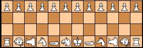
What charm the old logo had for me was mainly in its use of different fonts for each letter of Chess Variant. Without that, it really holds no appeal for me. In particular, I don't like how placing each letter on a separate square limits what can be done with the typography, forcing non-proportional spacing, which makes it harder to treat words as single units. This is probably one of the reasons that not one single Chess website I looked at did this in its logo. To convey the idea of Chess-like games, it is sufficient to include a piece or two. Including a Chess board background is superfluous.
I was thinking about that afterwards, because east is normally on the right side of a map. But from my American perspective, it works out, because Asia is to the left of America on a map, and Europe is to the right. Anyway, the logo is not meant to be a map, and I'm happy with the positioning from an aesthetic perspective.
I'm curious - are you happy representationally with the East-West positioning of the images in the top left logo?
H. G. Muller wrote on Sun, Sep 3, 2017 09:07 PM UTC:I still would like the small logo to be more colorful. E.g. a yellow-to-orange color gradient as background. And the word Chess in dark blue. This would also remind more of the old logo, wthout changing anything essential to the new one.
BTW, the logo I posted was just a quick and dirty hack job; If we decide to use it, I can make the alignment of the various elements more precise. The inverted E was supposed to symbolize this is not ordinary Chess, but Chess with a twist. But if people don't like it I can use a regular 'E'. Note that I wrote everything just in a single font (Times New Roman); All the different fonts in the old logo just caused it to look messy, IMO.
I just entered Chess into Duckduckgo and looked at the logos for several other Chess sites. With the exception of the House of Staunton, which I already knew about, none of them really impressed me. The font choice usually seemed uninspired, and the pieces used in the logos were often crude sillouettes. Some sites for kids used cartoon images of pieces, but that wouldn't be suitable for this site. None of them combined a Chess board with Chess pieces. It was normally one or the other and usually just one piece, though sometimes two or three. Compared to these, I'm happy with the latest logo I designed.
While it would be desirable to include something of Chinese Chess in the logo, I want to avoid letting it get too busy. When other sites included three pieces in the logo, they started looking less professional to me. So it's for the best that I don't include more than two pieces. That leaves the Shogi piece to do the job of representing all Asian variants, including Chinese Chess, while the unicorn represents the western tradition of Chess variants.
I have started a trial run of the latest draft. We could have a different, larger logo on the front page, but I don't think we have the right one for that just yet. Another possibility is to use the space currently occupied by the large logo to display a featured Chess variant or some of the Chess variants mentioned in the introduction.
25 comments displayed
Permalink to the exact comments currently displayed.
Got it. Sorry, I didn't read your previous post well enough.