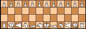
I think movement-diagram-inspired piece symbols can work, when you don't try to reproduce the movement diagram too literally. After all, the purpose of a piece representation in a game position is not to teach a completely unintiated player how the piece moves. Perhaps only to give him a hint for that. But he can be expected to know how these hints are encoded in the shape. The most important is that the shapes are strikingly different. Then the palyer will identify them at first glance, just like he would be able to distinguis the picture of a camel and a horse in a pictorial representation, or the various kanji in an oriental representation. In the end these are all just shapes that have to be distinguished from each other; camel or horse heads mean just as little to a person who has never seen an animal in his life as kanji do to a westerner.
Your Knight, Camel and Zebra representations fail the criterion of easy distinction. They are 'topologically similar', and the distinction has to come from carefully examining the distances. It would be much better to indicate smaller distances by making those touch, as touching / non-touching is an absolute difference. Like:
People that would no longer be able to recognize it as the move diagram can simply memorize "this shape is a Camel, and that shape is a Zebra", which still doesn't make them off any worse then whether they had to memorize which kanji stands for Gold and which for Silver.
I also would not make the arow you use to indicate sliding too long; it causes too much disparity in the size of symbols, and also makes the symbols for Rooks and Bishops have too little 'body'. Much better to indicate infinite-range sliding by something in the width of the lines. E.g. like making it extra thick.